ALITALIA
1 Logos and restyling over time
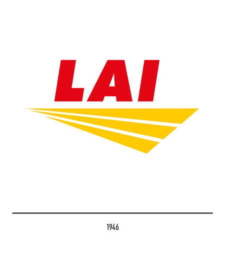
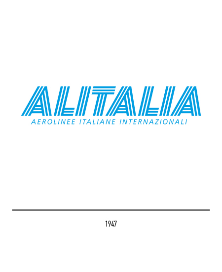
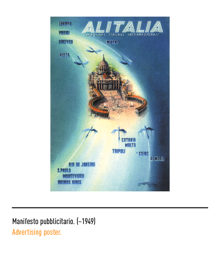
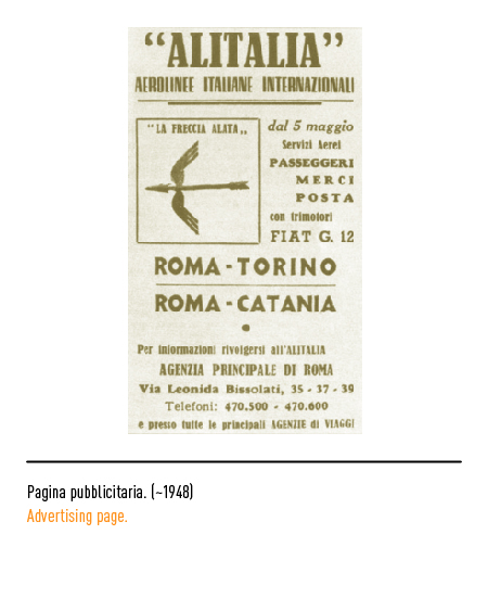
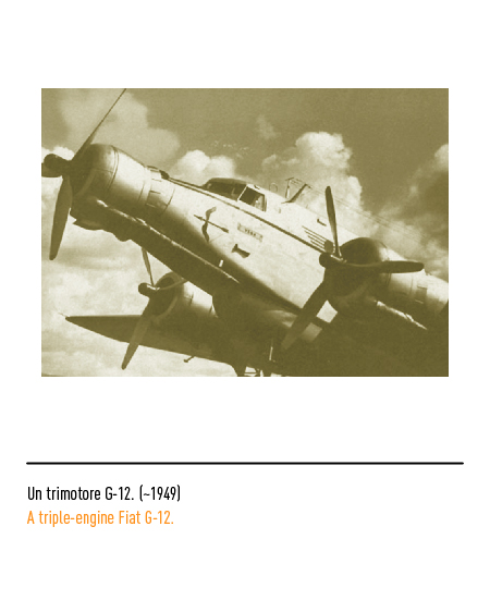
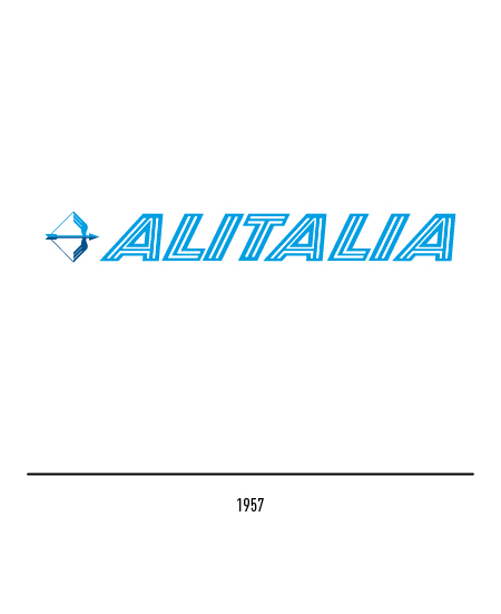
After the Second World War, two airlines operated in Italy: LAI (Italian Airlines) and Alitalia, managed with the intervention of the Americans and the British. The first air connection was made in 1947 with the Turin-Rome-Catania flight. The LAI logo featured letters underlined by a stylized wing consisting of three elements; the first Alitalia logo, on the other hand, was chosen in 1947 following a national competition and depicted a blue and blue winged arrow, formerly a frieze of the first flock of the Italian Air Force in the First World War; this graphic sign was flanked by the blue logotype composed in capital letters in three bands.
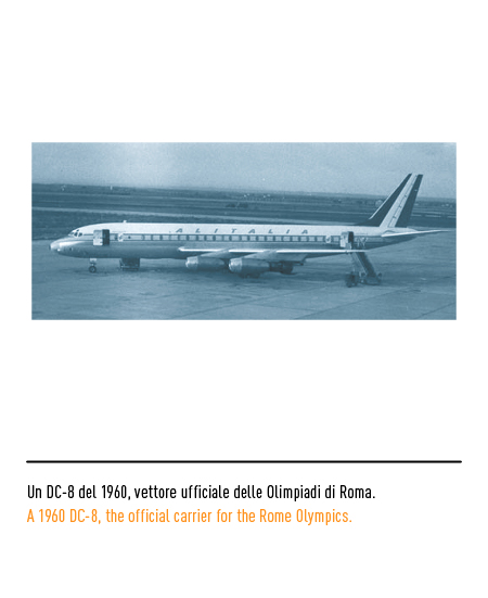
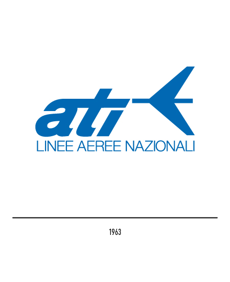
The latter was, in 1957, subjected to a slight restyling as the activities of LAI were merged with those of Alitalia and from that moment it became the national airline managed entirely by Italian management. The national carrier ATI (Aero Trasporti Italiani) was established in 1963 and was incorporated into Alitalia in 1994; his first logo featured the acronym next to a stylized plane. The Alitalia symbols, to tell the truth, were not particularly interesting from a graphic point of view: the winged arrow was barely visible on the airplanes, it was a fairly common element in aeronautical symbology and did not show any compositional research studies; likewise, the writing along the fuselage was rather anonymous.
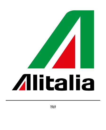
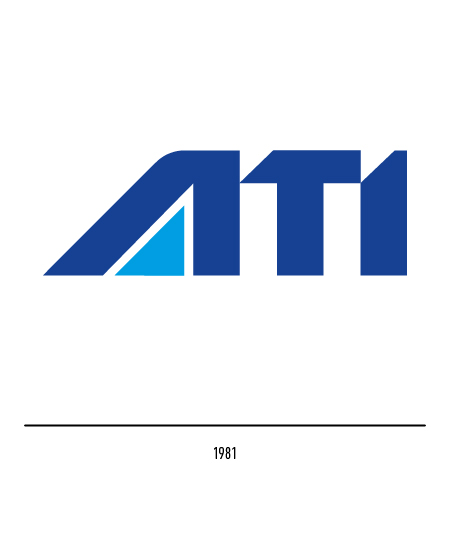
In 1969, as part of a global renewal action, Alitalia launched an international competition for the design of the new logo. The competition was won by Landor Associates and the logo chosen had the advantage of immediately representing both national membership with the tricolor letter “A” and the shape of the vertical rear fletching of the flag aircraft; all accompanied by the original lettering on a green stripe of the fuselage in place of the previous “pentagram”. Even the ATI logo, in 1981, will be similar to the Alitalia one but with different colors.
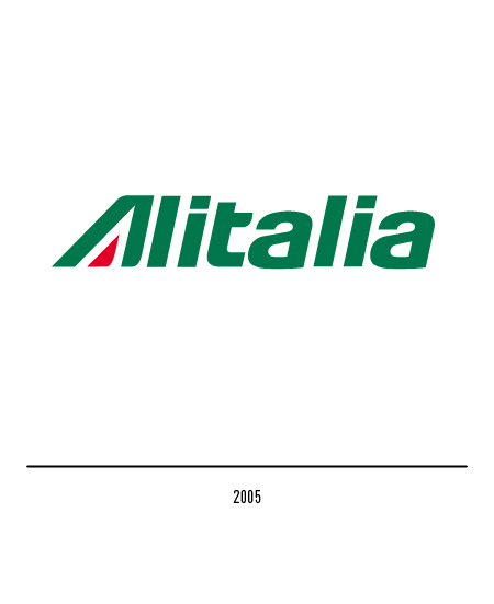
In 2005, to symbolize the company’s repositioning on the market, the graphic restyling of the logotype was decided; the Saatchi & Saatchi agency opted for an inclination of the logo to the right and a partial rounding of the vertical rods.
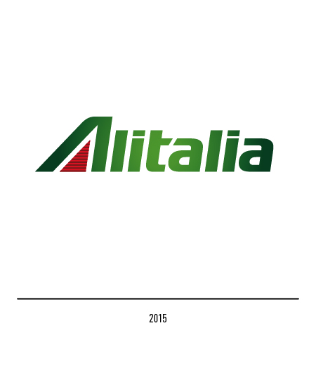
In 2015 the national airline launched a new phase of its renewal process by presenting the new visual identity, including the new livery, with the aim of affirming the company as an innovative and sophisticated leader in the sector and representing the best of Italy in the world. Landor was commissioned to create the new logo using elements of the design of the previous one, designed by Landor itself in 1969. The logo has been made more modern with the presence of the more dominant “A” and the continuous junction between the letters “t ” it’s at”; for the letters the green color has been preserved with a glow in the center. Drawing inspiration in part from the lines of racing cars, streaks have been added to the red inner triangle of the “A” creating a pinstripe effect that reflects exclusivity, attention to detail and a strong attention to design. The fuselages no longer have the green band and are painted in pearl ivory, representative of the sobriety of the Italian style; feature transverse soft lines that extend to the vertical stabilizer to create the idea of movement, speed and unhindered progress.
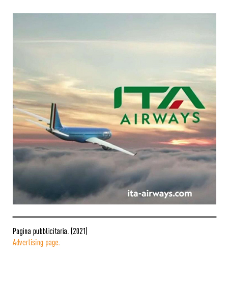
In 2018, the logo was restored to its 2005 appearance, that is, by eliminating the gradient fill of the logotype. In 2021, after a slow decline, a new management replaces the glorious history of the national company; the new name of the airline is presented, “Ita Airways”, and the related logo with the green acronym in capital letters and a red element of the letter “A”. The visual identity was signed by the “Landor & Fitch” agency; the planes show a completely blue livery with a nod to the sporting successes of the Italian athletes. Then on the fuselage the logo in white, the tricolor on the tail with stylized icons inspired by our artistic heritage.


