AMPLIFON
1 Logos and restyling over time
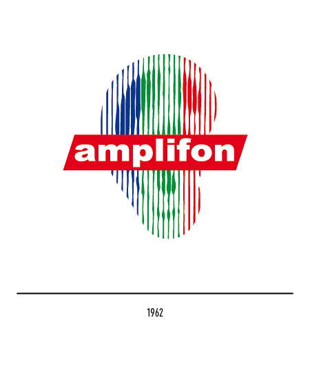
In 1962 the company changed the logo and was distinguished with a white logo on a red rectangle above a knurled ear. In 1971 the company founded the Amplifon Research and Study Center (CRS), an independent body aimed at disseminating knowledge in the audiology and otology fields.
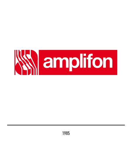
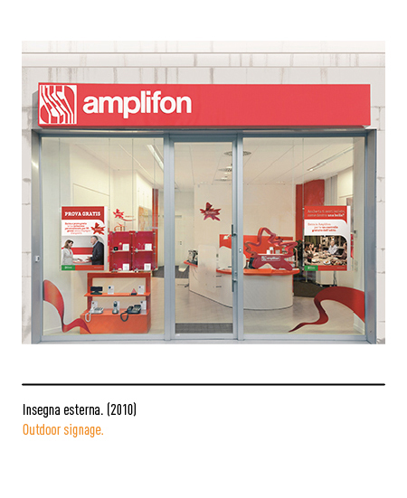
In 1985 the logo became more modern thanks to the letter “a” stylized with acoustic waves; then the white logotype, composed in Helvetica, inside a red rectangle. In the nineties, the strategy shifts towards personalized customer service and attention to technological progress with the introduction in Italy of the first fully digital hearing aids in 1996. In 2009, a partial restyling of the visual identity is planned with the same superimposed logo to a red variable motif generated by computer graphics.
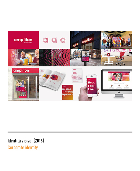
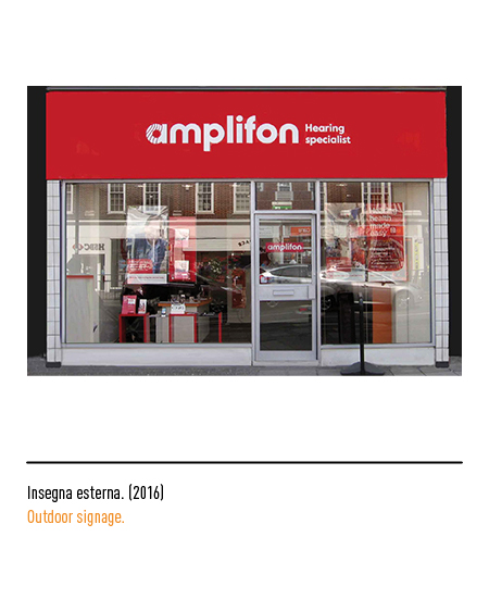
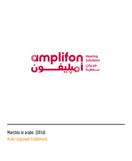
In 2016, for the 66th anniversary, the Landor agency received the award for the restyling of the logo in order to support the company in defining a new ambitious logo positioning and in the development of a complete rebranding; it was necessary to symbolize the continuous development of Amplion innovation in order to position itself as a supplier of quality solutions with great dynamism and experience, always careful to meet customer needs. In particular, rather than insisting on hearing loss, Amplifon now makes the choice of highlighting the benefit produced and the quality of life or sound found. Outside its frame, the logo looks less technical and communicates a strong sense of freedom. In addition to the rounded letters, there is also the transition from red to burgundy which helps to give the logo more warmth and breadth; the curved lines within the “a” form softer sound waves.


