ANSALDO
1 Logos and restyling over time
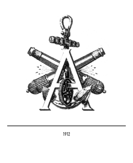
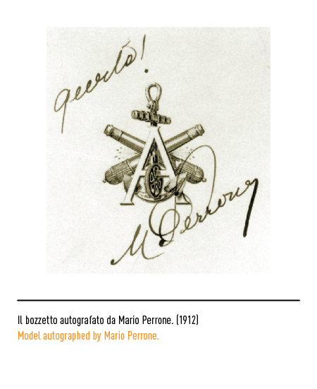
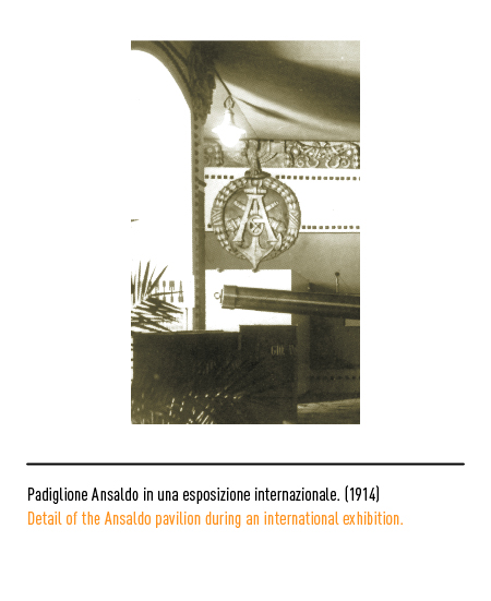
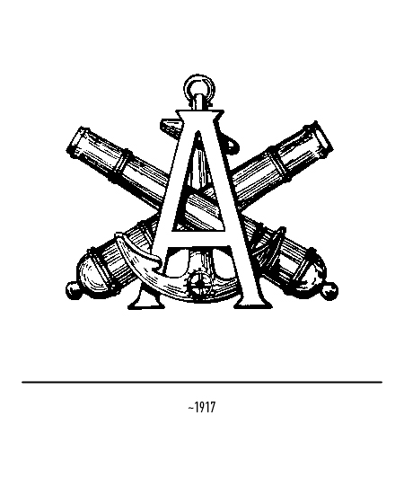
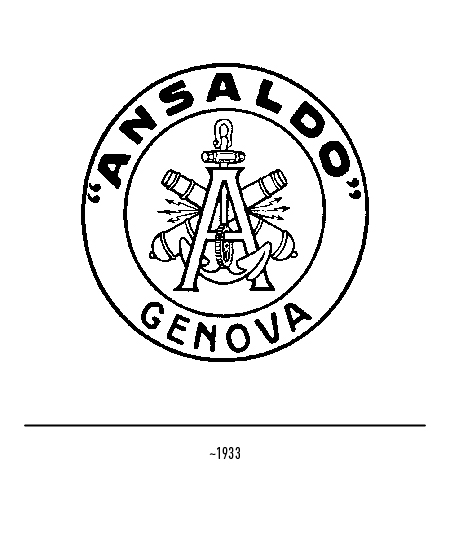
Navalmechanical industrial complex founded in 1853 in Sampierdarena, a suburb of Genoa, by engineer Giovanni Ansaldo at the suggestion of Cavour. The latter intended to have an Italian industry for the construction of locomotives, machines and ships, thus freeing the country from foreign dependence and called Giovanni Ansaldo, a university professor and founder of a popular school of applied mechanics, to direct it. Ansaldo was one of the most illustrious Italian car logos that disappeared following the world crisis of 1929. Until that date it was the protagonist of a troubled but significant ten-year experience from 1919 to 1929; from the production of locomotives and ships, the company was led to the production of cars by the needs of the reconversion of the first postwar period. The first Ansaldo logo was designed in 1912 by the engineer Soliani and approved by the CEO of the time, Mario Perrone; depicted the letter “A” graced with the toothed wheel for the mechanical industry, the anchor for the naval industry, two howitzers for the military one and lightning bolts for electrical equipment. It was used, until the Second World War, sometimes inscribed in a circle.
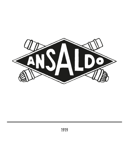
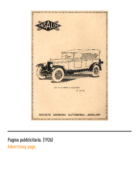
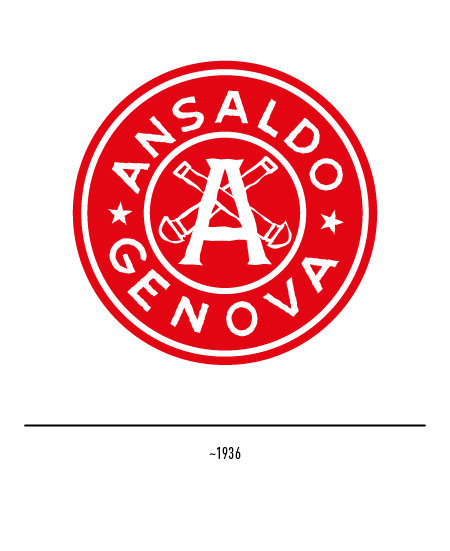
In 1919, the logo that appears on Ansaldo cars depicts the logo arranged in a rhombus with two crossed guns, a reference to artillery production.
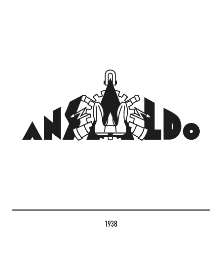
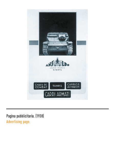
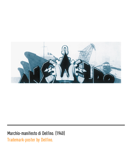
In 1938 the logo, designed by Delfino, was the essentialization of the first logo: stylized elements appeared together with a Fascist-style character that gave it a monumental body; sometimes only the logo appeared.
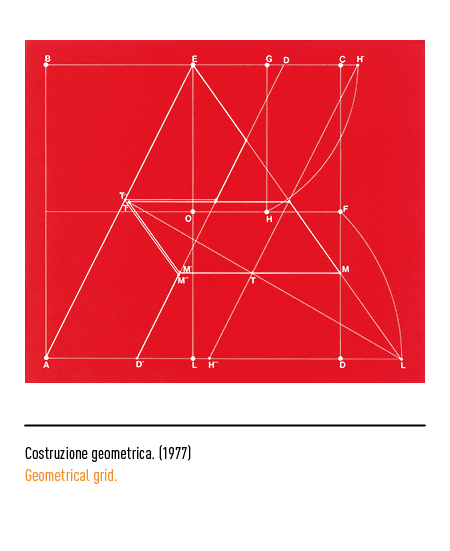
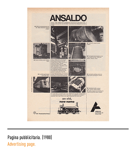
In 1966 Ansaldo definitively abandoned the mechanical and naval sector for the electromechanical and transport sector. In 1977, to keep up with the times, the redesign of the logo was thought of (designed by Pino Cavanna and Aristo Ciruzzi of the graphic studio “Immagine & Comunicazione” in Genoa) with the use of the uppercase Helvetica font and a graphic sign, composed of modular, which read the letter “A”.
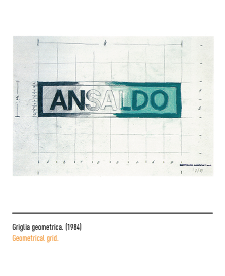
In 1984 Ansaldo was in a phase of very complex transformation and the continuous change of the visual elements over time led to the need to redefine the logo: the focus was on maximum simplicity by reusing the existing logo. A frame was therefore created around the logo, both to obtain a strong visual characterization and to be able to combine it with any additional information through a modular system of frames. The entire renovation was handled by Sottsass Associati in collaboration with Ansaldo’s external relations management.
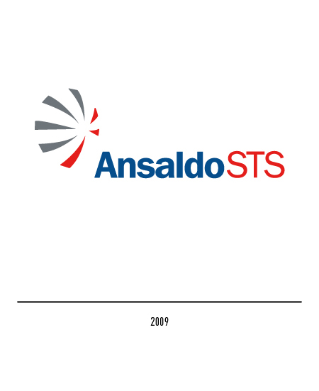
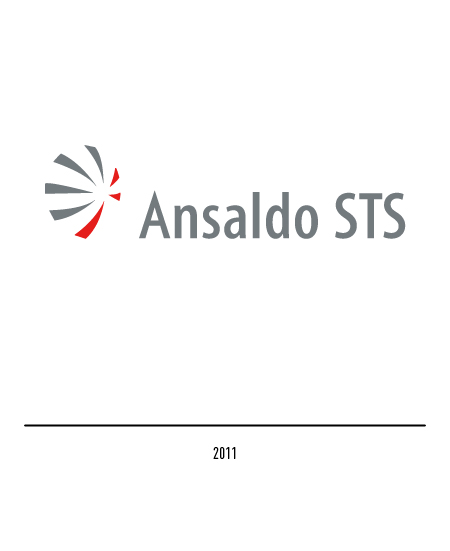
In 2001 it was absorbed by Finmeccanica taking the name of Ansaldo STS, acronym of “Signaling and Transportation Solutions”; in the following period it maintained its graphic identity within the group. When, in 2008, Carré Noir designed the new Finmeccanica logo, then the Ansaldo logo also showed the same group identity.
The name “Ansaldo” remains present in the corporate name of many companies set up through spin-off or into which some production sector has merged. The one that has virtually continued the same production activity is “Ansaldo Energia”, born in 2018. The logo has the name “Ansaldo” characterized by the gray “all lower case” and a vertical line separates it from the wording “energia” in red.


