AUTOBIANCHI
1 Logos and restyling over time
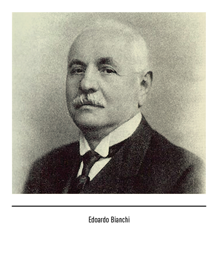
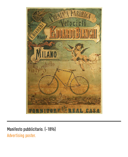
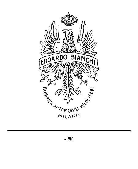
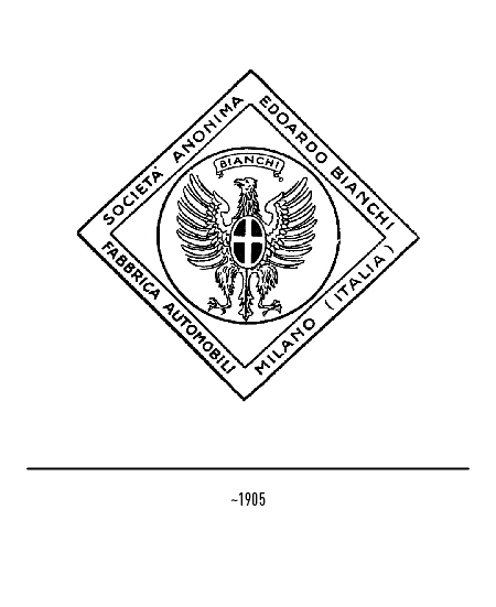
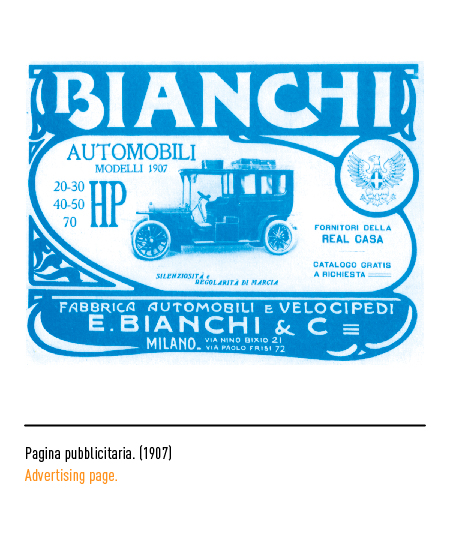
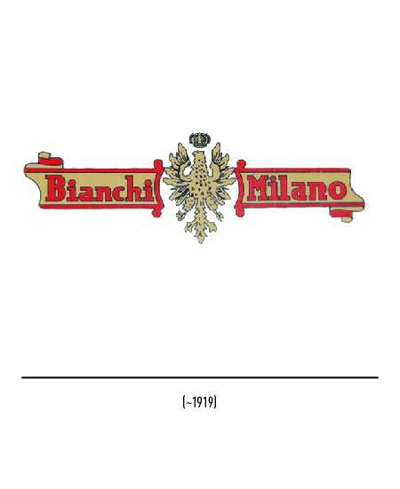
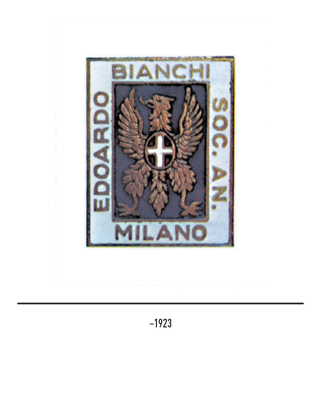
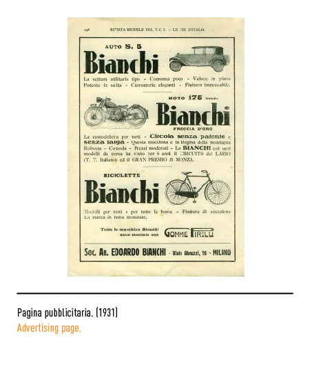
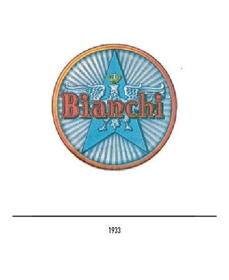
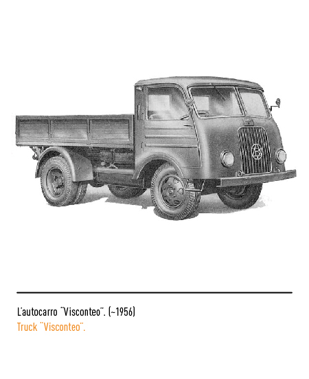
The automotive industry derived its name from Edoardo Bianchi who in 1885 opened a workshop in Milan for the construction of cycles and tricycles; in 1897 he experimented with the first motorized bicycle. At the beginning of the century, the first logo depicted a crowned eagle and the band with the name of the founder; later the Savoy shield was added because the company became a supplier of the Royal House.
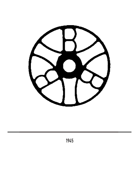
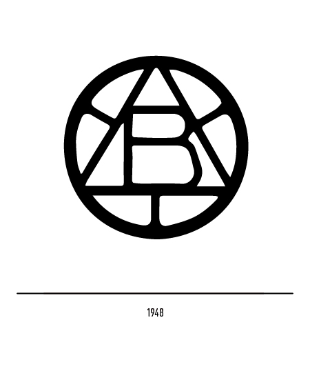
The Bianchi car division owned a circular logo with three “B” in 1945; in 1948 the letter “B” lived inside a triangle.
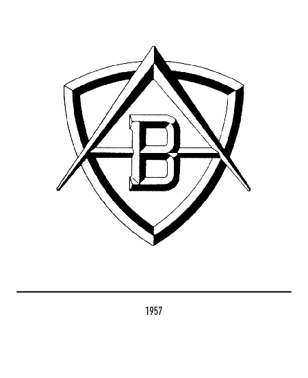
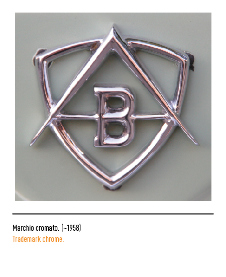
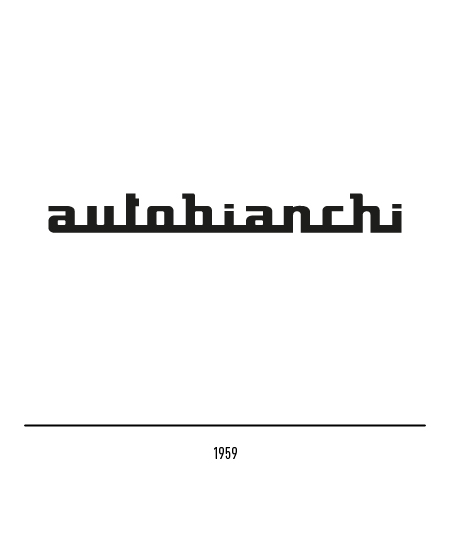
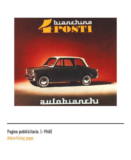
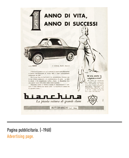
On the death of the founder in 1955, “Autobianchi SpA” was established in Desio (Milan) by his son Giuseppe, in close cooperation with Fiat and Pirelli, solely for the construction of cars. In 1957, the date of presentation of the “Bianchina”, the letters were inscribed inside a shield; the logo was used until 1959 when it was replaced by the stylized “Autobianchi” writing.
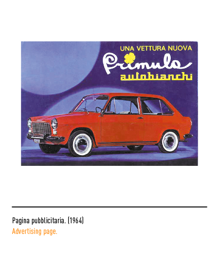
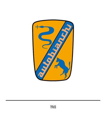
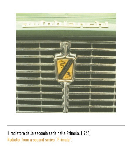
In 1965 the logo with the bull and the snake appeared, symbols of the aforementioned cooperation, it was with the presentation at the Paris show of the second series of the “Primula”.
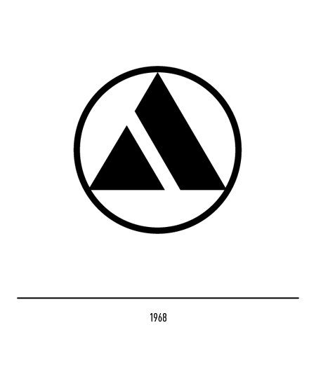
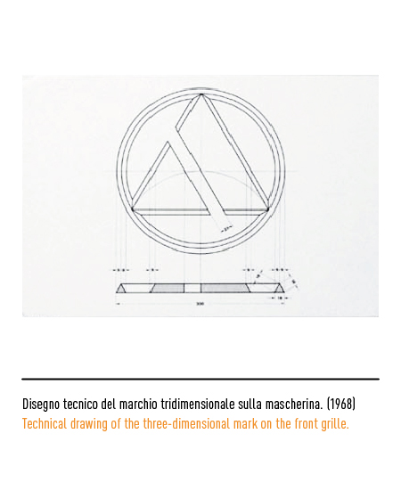
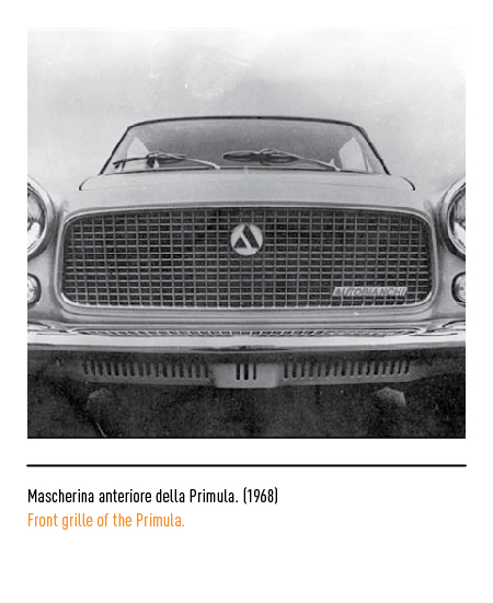
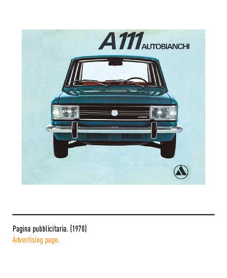
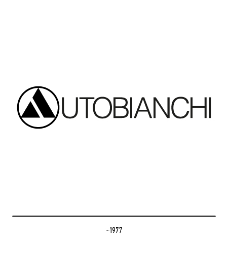
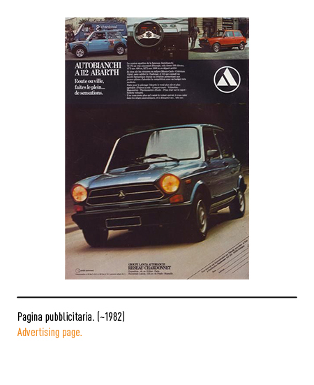
In 1968, when the company was absorbed by FIAT, the logo was replaced with the one designed by Ilio Negri in which a stylized letter “A” lived in a circular shape; sometimes this logo was used in place of the Autobianchi letter “A”.
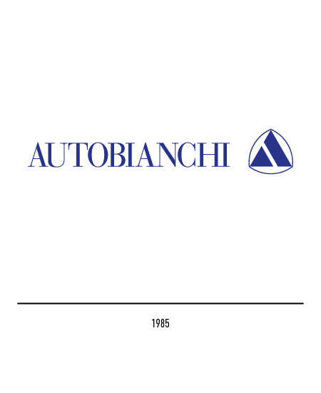
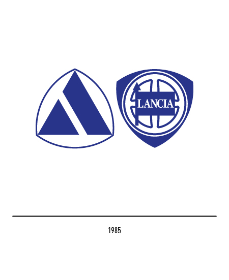
In 1985, following the agreements between Autobianchi and Lancia, the two logos always appeared united and, moreover, the stylized “A” also appeared in the characteristic Lancia shield but upside down.


