BANCA NAZIONALE DEL LAVORO
1 Logos and restyling over time
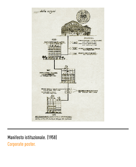
The bank was born in Rome in 1913 as a “National Credit Institute for Cooperation”; in 1927 it became the “National Bank of Labor and Cooperation” and, two years later, took on its current name. In 1936 it became a public law institution exercising short-term ordinary credit and in 1947 the first logo was designed: the intertwining of the three letters with typical movements of the time.
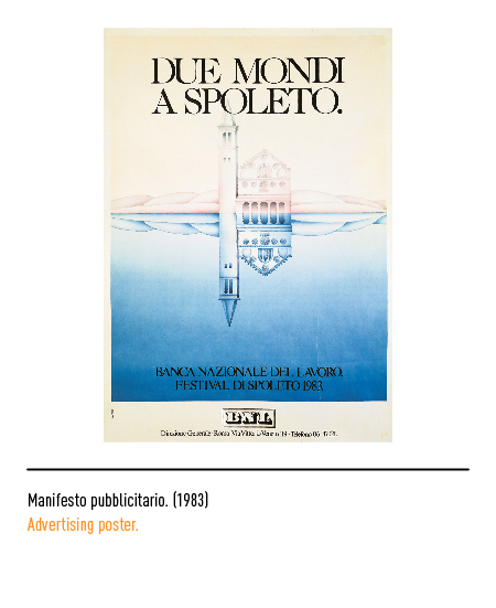
In the 1960s a new, more modern, compact, legible logo was created: it was made up of the chiaroscuro BNL writing and inserted in a black rectangle with double thread. In 1983, as evidenced by a resolution of its executive committee, the BNL questioned the validity of the logo and ordered its modification without abandoning it entirely, also because it was the only one to have been registered internationally. In 1984 the restyling of Armando Testa involved the positive transformation of the logo with the elimination of the fillets and the full name of “Banca Nazionale del Lavoro” making everything less burdened. This graphic structure allowed the identification of the logo even when the extreme reduction made the lateral writing in the center illegible from which the acronym Bnl appeared monumental.
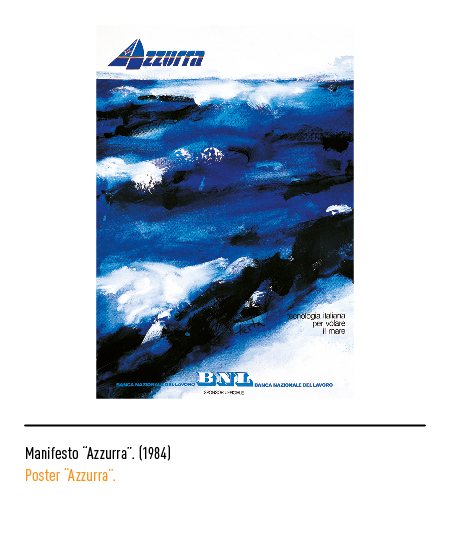
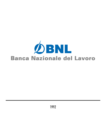
In 1992 it was transformed into a joint stock company; Landor Associates took inspiration from a successful advertising campaign to design the new logo: the stylized spinnaker of a sailboat with the acronym “Bnl” and the name composed of Univers capitalized even if, in 2000, the latter disappeared.
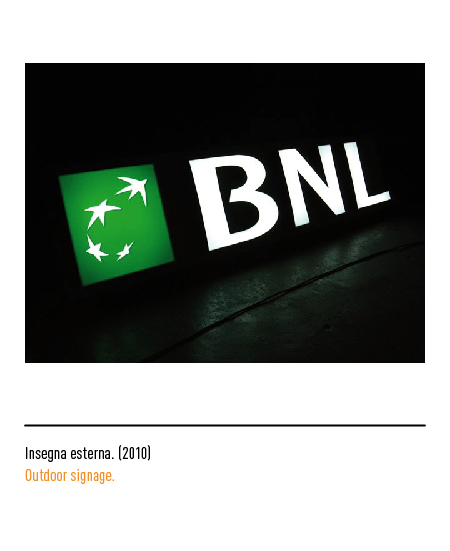
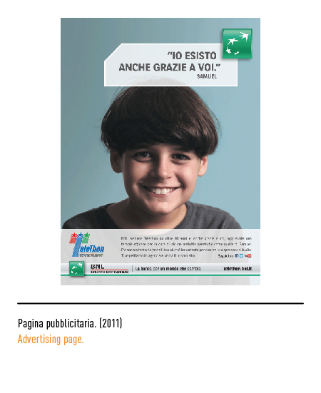
In 2006 she joined the French group BNP Paribas whose logo depicts the stars of Europe that are transformed into swallows, testifying to a continuous desire for change and innovation. Therefore, the Bnl brand undergoes a restyling: the acronym is composed with the institutional character and, the only exception for the identity of the group, the red underline of the logotype to display the Italian flag.
In 2018, to demonstrate the strengthening of the weight of the holding’s name, the wording “BNP Paribas” in the brand will have the same size as the “BNL” logo.


