BANCO DI NAPOLI
1 Logos and restyling over time
The origins of Banco di Napoli, a public-law credit institution, can be traced back to the foundation of the “Sacro Monte di Pietà” built in Naples in 1539; in reality, it seems that they are older: recent studies have shown that the progenitor of the Banco di Napoli was the “Casa Santa dell’Annunziata”, whose bank of deposits and loans carried out operations since 1463. The “Monte di Pietà” were set up by groups of aristocratic and wealthy benefactors to free the poor from usury with interest-free pawnbrokers. Tradition, however, has it that the Banco di Napoli arose from the union of eight institutions: the Sacro Monte di Pietà (1539), the Sacro Monte dei Poveri (1563), the Banco della Santissima Annunziata (1587), the Banco di Santa Maria del Popolo (1589), the Banco dello Spirito Santo (1590), the Banco di Sant’Eligio (1592), the Banco di San Giacomo and Vittoria (1597), the Banco del Santissimo Salvatore (1640).
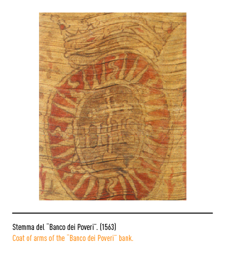
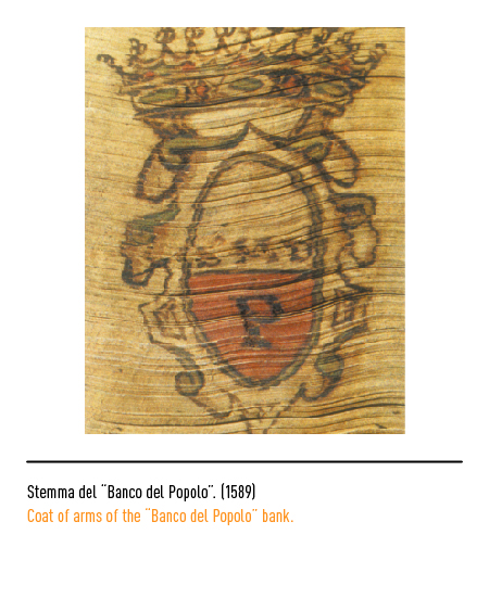
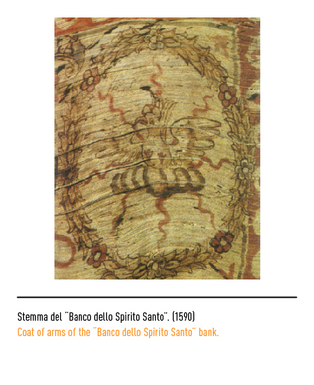
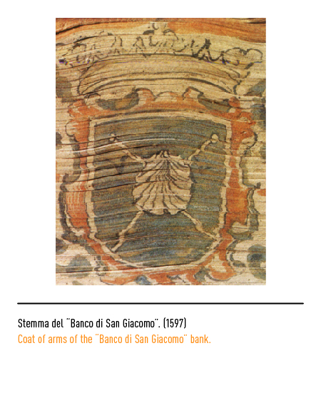
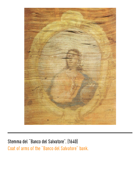
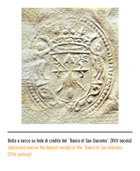
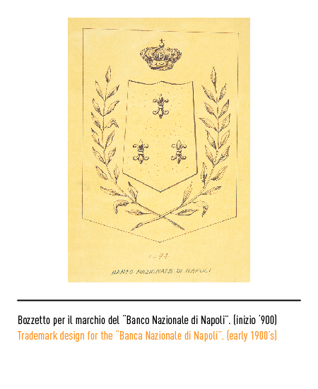
In 1794 Ferdinand IV of Bourbon gathered all the public banks in the “Banco Nazionale di Napoli”. After successive suppressions and mergers implemented by the Napoleonic regime of Gioacchino Murat, the banks merged in 1809 into the “Banco Nazionale delle Due Sicilie”. With the proclamation of the Kingdom of Italy, in 1861, it became “Banco di Napoli”. The heraldic coat of arms, officially deposited in 1905, represented an iconographic synthesis of only four of the ancient Neapolitan public benches, whose coats of arms are visible on the cuts of the accounting books.
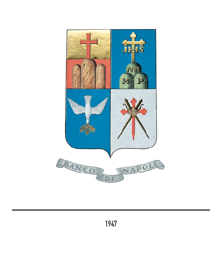
In the first quadrant at the top left there is, on the yellow and red background, a cross at Calvary placed on three mountains (Sacro Monte di Pietà); in the second blue quadrant, the flying silver dove as a symbol of the Holy Spirit, radiant with gold from its beak and upside down (Banco dello Spirito Santo); in the third quadrant of gold, the red sword of San Jago in the shape of a trifoliate cross, long and pointed, crossed with two pilgrim’s sticks and all surmounted by a shell (Banco di San Giacomo); in the fourth quadrant, in blue, the gold trifoliate cross of Calvary with the JHS monogram over three green mountains with the letter M for “mons”, P for “pauperum”, ND for “nomine dei” (Monte dei Poveri del Sacro Name of God). The monogram BN with the intertwined letters stood out over everything in a yellow and red oval.
In 1947 the logo was modified with the introduction of the Samnite-shaped shield and a fluttering band bearing the words “Banco di Napoli”; the dials were appropriately repositioned, perhaps for chromatic reasons. In the seventies, in the absence of strong graphic constraints, the coat of arms was used together with the logotype composed with an Egyptian character, that is, with squared and heavy graces; sometimes only the logotype was used.
In 1989 the Banco di Napoli renewed its image starting from the logo which appeared modern and stylized but which has taken up the heraldic characteristics of the old distinctive sign acquiring renewed vigor in an ovoid field defined by opposing modules; the logotype is composed with the Carla font. This 1947 logo is used by the Historical Archive.
In 2003, the merger of the Sanpaolo group into the Banca Intesa group placed Banco di Napoli within a larger national and international banking group; in 2007 the Banco di Napoli took back the old name together with the three colored arches of an aqueduct, a solid stone structure that symbolizes dynamism and development, a logo of the Intesa San Paolo group.


