THE WAY LOGOS CHANGE
METAMORPHOSIS OF 60 ITALIAN LOGOS
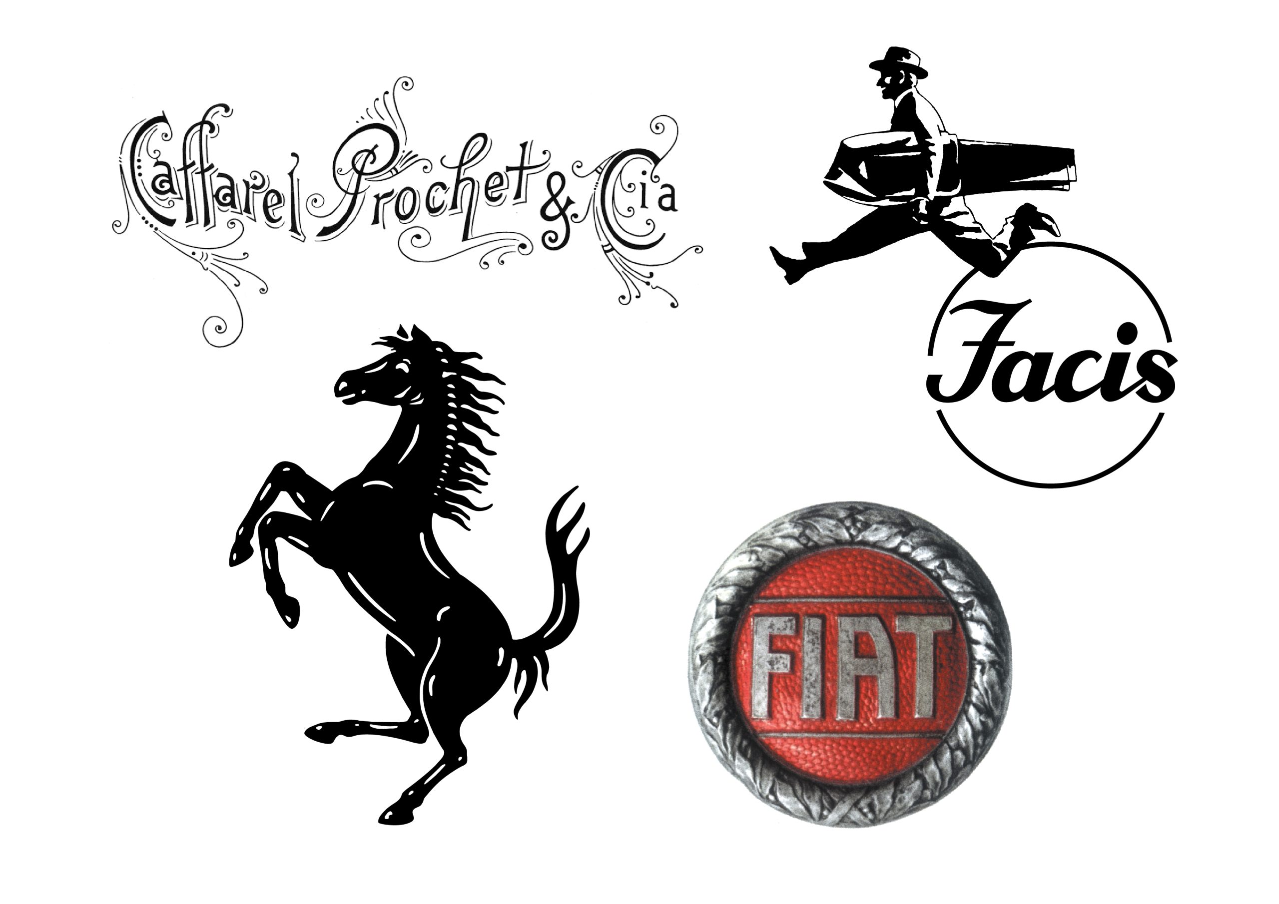
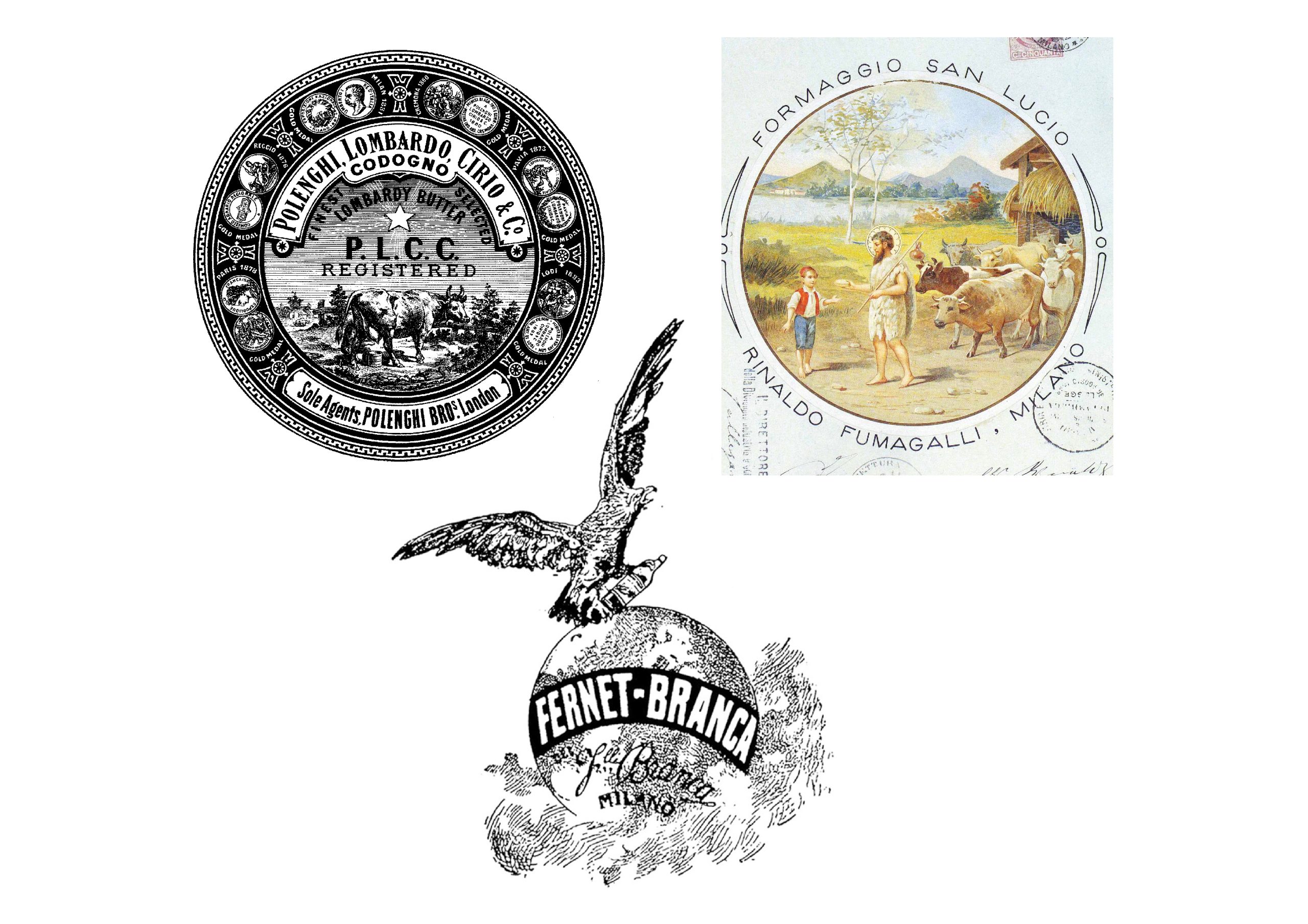
The book consists of 224 color pages with a matt laminated cover. The treatment of the 60 cases, arranged in alphabetical order, follows the logic of the chronology as well as the presentation of the trademarks with, where possible, one or more applications on advertising pages, posters or tables of the visual identity manual. Trademarks show only the creation date while applications show a caption with date; uncertain dates are preceded by a graphic sign (~).

Can trade-marks grow old?

(…) For the graphic designer, designing an identity is a coveted project. And the heart of an identity for any person who commissions it (from the rock group to the multinational) is the brand. The smallest particle, but until recently, the most powerful dispenser of personality and subjectivity. And so when the graphic engages with the design of this special artifact, it gives its best, because it sees in that project the visual representation of an entity, of a body that expresses itself and manifests itself. It is essentially a highly “creative” act. And like all creative acts, we would like to be strong and propulsive, capable of growing and lasting over time. But even looking at this book, we wonder: Can brands get old? To answer this question it is necessary to understand how a brand is built and what are the components that are subject to the signs of aging. And if the “signs of aging” cannot also be an added value. (…)
The trade-mark and its evolution

(…) The trademark is a signature that is expressed in the form of an emblem. The examples in history are endless, just think of the first significant examples of “publishing brand” at the end of the fifteenth century, from the sign as a heraldic citation of Johann Fust and Peter Schöffer, or of devotion, with references to the cross and cosmological attributes as in brand of Nicolas Jenson in Venice. The modern brand finds its genesis in the proto-industrial era, but according to our current conception of graphic design, it should be remembered that at the turn of the century between the nineteenth and twentieth centuries, Italy is certainly not at the forefront in this field. The unity of the country in that period is still a recent thing, with a predominantly agricultural system economy. Furthermore, we have not lived experiences like the English one of the Arts and Crafts, despite the fact that industrial productions are questioned, or, movements like the Werkbund in Germany have not formed. (…)
The trade-mark of style

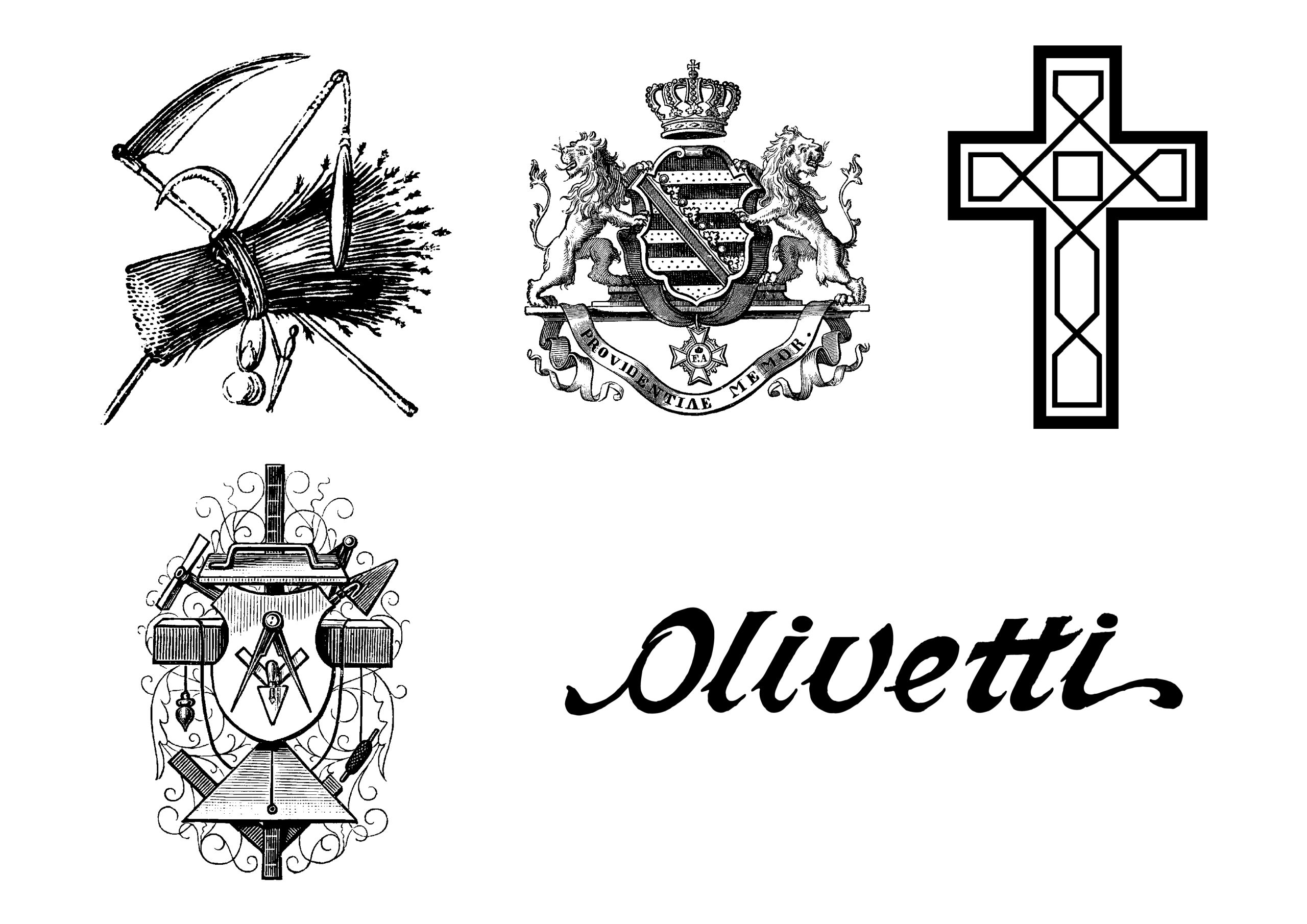
(…) The institutional identity sector is one of the great engines, in an economic as well as a design sense, of graphic design. The corporate identity machine was born in the 1950s almost in response to the emergence of an advertising market that shifts interest to the product, rather than the company. The logic of the coordinated image (which is the technical tool of the corporate) leads to the need to apply the brand to an increasingly extensive and varied range of supports. Phenomenon clearly visible today, which radically influences the design approach of the brand itself when it is applied from archigraphy to the web. There is also a problem related to the scarcity of visual assets to refer to when brands enter a market that – forgive us the banality – is becoming global not only for large companies. Letters, classical iconography (lions, eagles, etc.), geometric shapes represent a limited patrimony, in terms of numbers, which can from time to time be revitalized by archives coming from other strong figurative cultures (very few, actually), by local signs , from pertinence to product sectors, or even from formal stylistic features that have become iconographic apparatus. (…)
From the eye of the consumer to the soul of firm

(…) The use of a graphic sign with symbolic value is very ancient and equally ancient is the application of the same to a whole series of objects, places, images connected to each other by the common functional destination. From the fasces of ancient Rome, to the military insignia – with all their load of emblematic values - from the Christian cross to the blouses of the workers of Maoist China, History provides us with countless examples of applications and declinations of what we commonly define today as an image coordinated. In the strictly commodity and commercial field, the concept of “coordinated image” is actually more precise and refers to the integrated communication implemented voluntarily by a company, according to a precise strategic project, in order to create or consolidate the desired image . For a business organization, keeping the image under control therefore means providing the various recipients of the message with a uniform and undistorted idea, perhaps due to involuntary behavior, of one’s real identity. (…)

