BULGARI
1 Logos and restyling over time
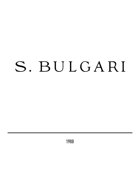
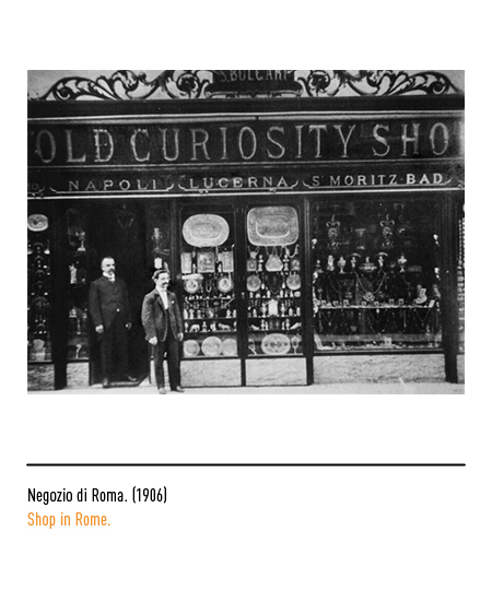
In 1900, the logotype appeared for the first time with the dotted name and surname of the founder, composed with a lapidary character.
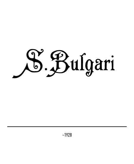
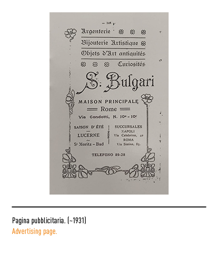
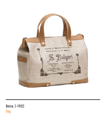
At the end of the 1920s another logo appeared composed with the initials in capital letters and the rest in lowercase; the font used had original movements and graces.
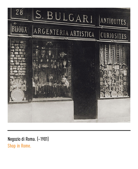
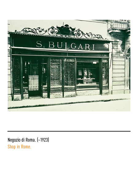
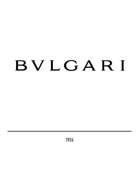
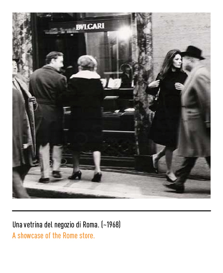
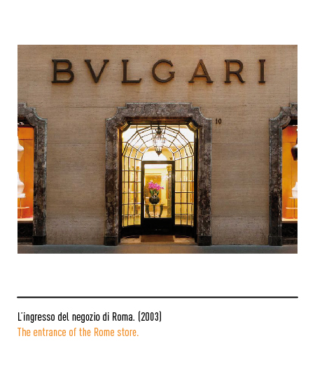
To honor its courtly past, Bulgari kept the original Latin “V” of the family surname which he had engraved on his shop during the major restoration works in 1934 for the fiftieth anniversary of its foundation. The refined silver jewelry he forged immediately met with great success with local customers and wealthy British and American tourists. In the Thirties Costantino and Giorgio, sons of Sotiris, joined the company: the former, well versed in the study and interested in the silver collecting side, began to collect antiques, carved jades, icons and art objects more in general; the second, on the other hand, devoted himself to the creative aspect of the business, thanks to his knowledge of stones, design and processing techniques. In the 1950s and 1960s, Bulgari became the reference point for the nobility, for wealthy foreign tourists on holiday in Rome, for the cinema jet set, establishing itself as a luxury logo recognized all over the world. Over the years, Bulgari’s success has continued to grow, so much so that the company decides to expand the business to other sectors as well.


