CAFFAREL
1 Logos and restyling over time
Later the logo went back to the liberty style, typical of the romantic and carefree taste of the “belle epoque”, coexisting with logos composed with other spellings, especially in the wrapping for chocolate: with calligraphic strokes, with shading, with flourishes and with alphabets of vanguard.
Then in the 1940s the image was strengthened with only the wording “Caffarel” and without “Prochet”; the stretch became more robust and decisive, evidence of the growing importance that the company was assuming. In 1948 the logotype became more calibrated and rigorous enough to reflect industrial development with respect for tradition.
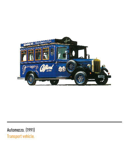
In 1991, another logo restyling operation was necessary, where the phrase with the historical reference to the year of foundation also appeared. The preservation of the graphic style could only refer to a writing with a marked lithographic flavor being, at that time, this process of printing on a special stone was very widespread.
In 2002 the calligraphic writing of the 1940s was revived and updated. In 2006, to celebrate 180 years of tradition, the logo also underwent a restyling: the logo, which incorporates the movements of the character of a 1916 logo, is arranged horizontally within a hazelnut-colored oval and with the pay -off “Piedmontese excellence”; the packaging is also characterized by new and elegant graphics.
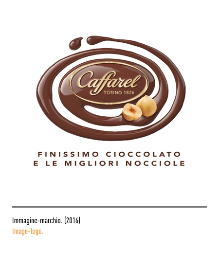
In 2016, for the 190th anniversary of its foundation, a new elegant brand, recognized in the world of taste as an ambassador of “Made in Italy”. Graphically it is characterized by the gold color on a brown background, showing no longer a pay-off but the city and the date of foundation.


