CAMPARI
1 Logos and restyling over time
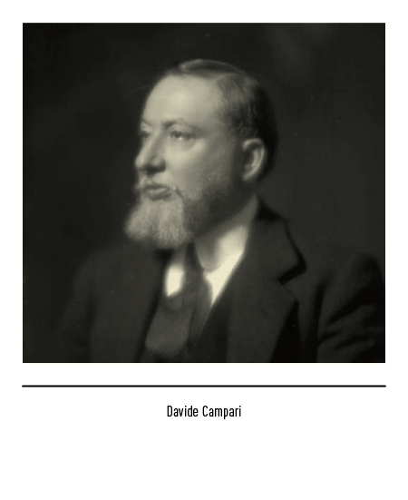
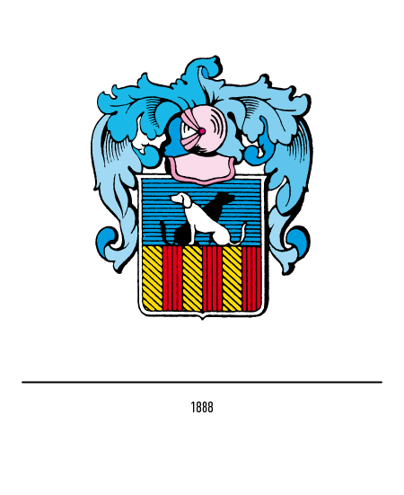
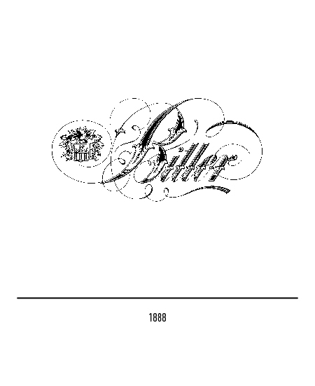
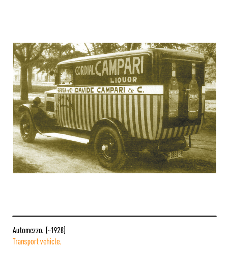
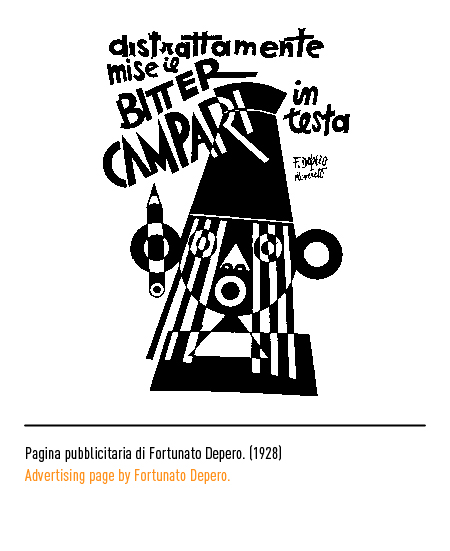
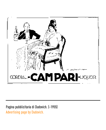
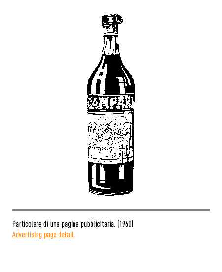
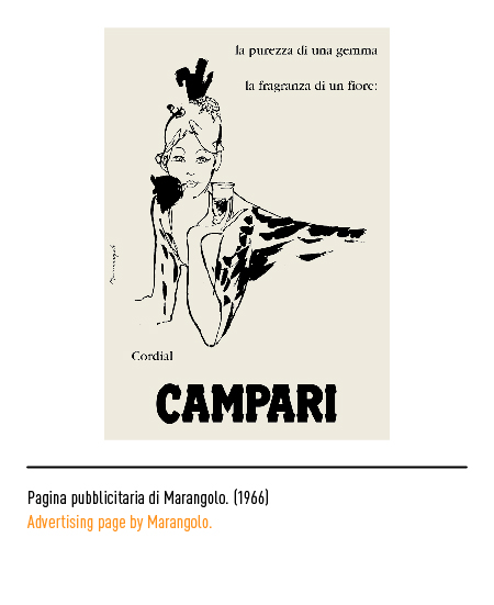
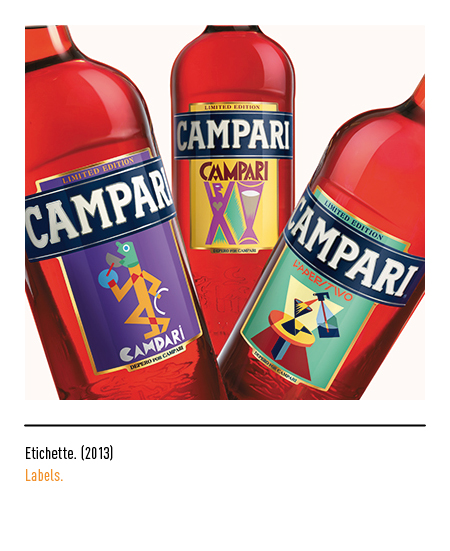
The liquor factory was founded in 1860 by Gaspare Campari in Milan. In 1882, on the death of the founder, one of his five sons, Davide, introduced fundamental changes transforming the company into one of the best known abroad: from “Liquoreria Campari” to “Gaspare Campari-Fratelli Campari successori” in 1902 and then “Davide Campari & C. “. The latter invested heavily in communication, so much so that various advertising posters were designed by Fortunato Depero (who designed the original Campari Soda bottle in 1928), Marcello Dudovich, Marcello Nizzoli, Erberto Carboni, Leonetto Cappiello, Bruno Munari (who designed in 1964 the famous manifesto). The first signature-logos “Bitter” and “Cordial” were registered in 1888 together with the heraldic coat of arms of the family “… formed by a shield with the figure of two crouched dogs and surmounted by a helmet with ornamental foliage”.
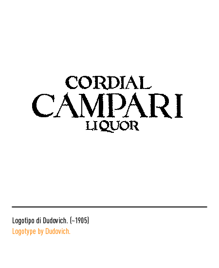
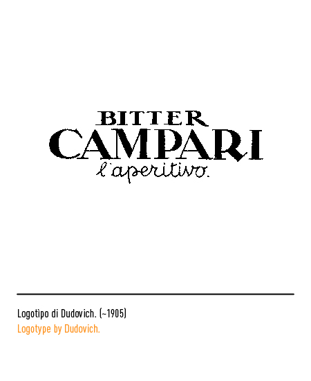
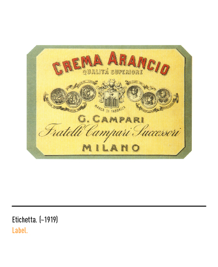
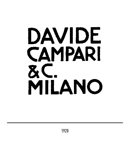
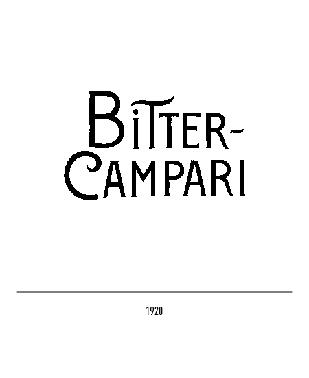
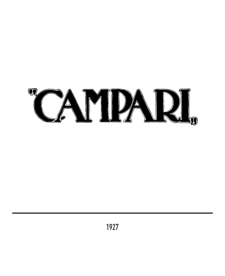
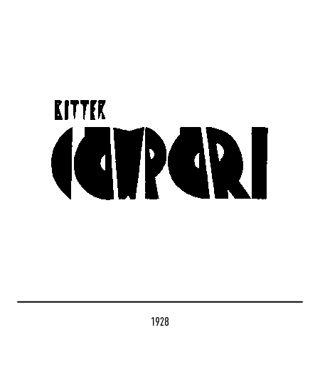
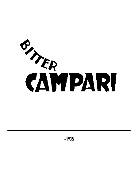
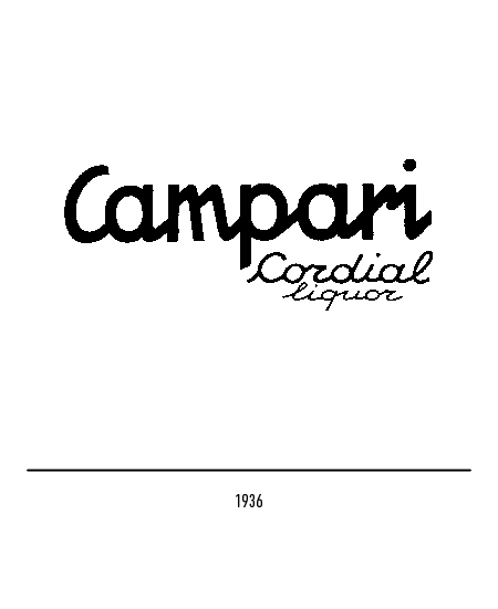
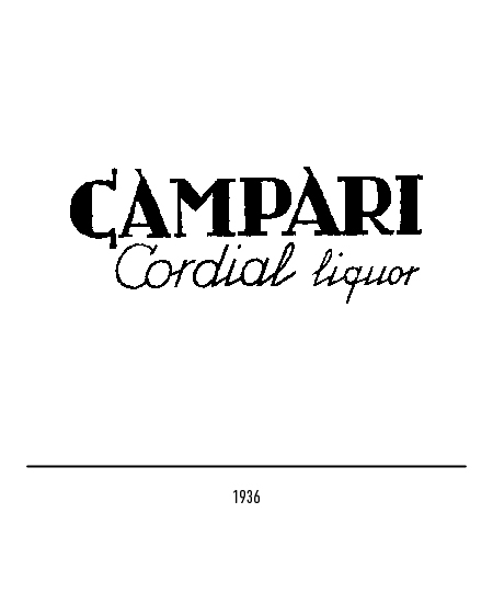
In its history, Campari has modified the logo several times, even substantially, as it has voluntarily translated its graphic language into the stylistic stamps of the various moments of art, fashion and taste.
This attitude towards communication, ie not appearing with the same logo, has become typical, imitable and defined as an “open coordinated image”.
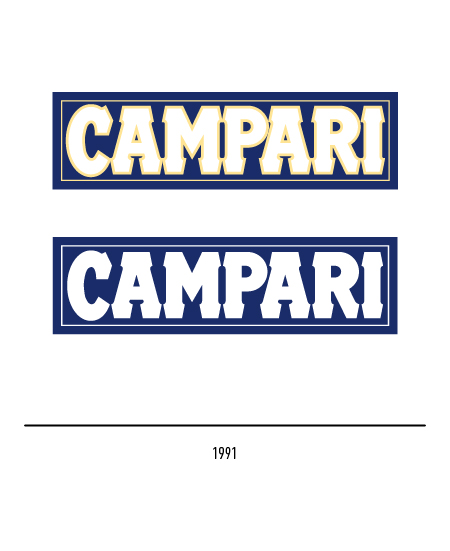
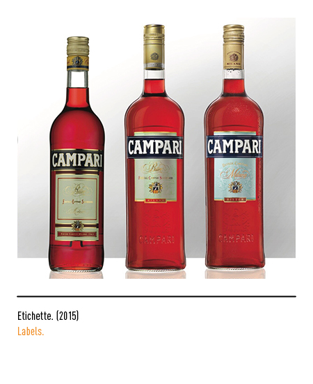
In 1987 it became necessary to definitively fix the graphic standards which was carried out by G&R Associati operating a sort of restoration, of philological work on the logotypes after a century of graphic layering. The most recurrent ones were selected starting from the foundation and the Campari logo registered in 1912, the most used since the second post-war period, was chosen. In 1991 the logo lives inside a rectangle.
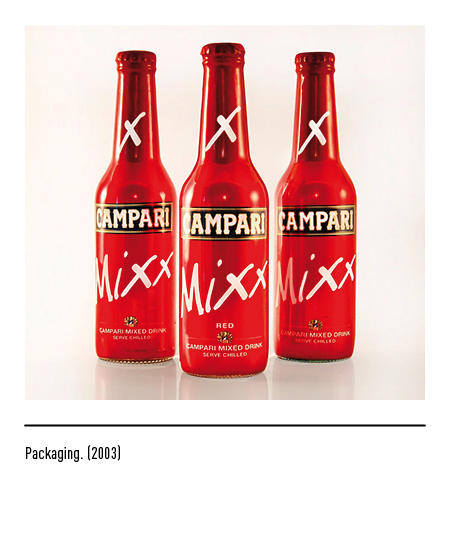
The London graphic agency Claessens was commissioned for the restyling of the logo in 2005, bringing a greater lightness to the character.


