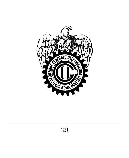
Confindustria is the main representative organization of manufacturing and service companies in Italy; has been proposing since 1910 to contribute, together with political institutions and economic, social and cultural organizations to the economic growth and social progress of the country. After13 years its foundation, the idea of having a tangible emblem of identity for the organization is considered; Thus the first logo was created in 1923, which represents an eagle above a toothed wheel on which the name of the time was written, or “General Confederation of Italian Industry”. The choice of symbolism reflects the will of the association to support the country towards social and economic growth; the eagle, a symbol of strength and independence, and the toothed wheel, a symbol of the factory system, underline the propulsive role of the entrepreneurial class.
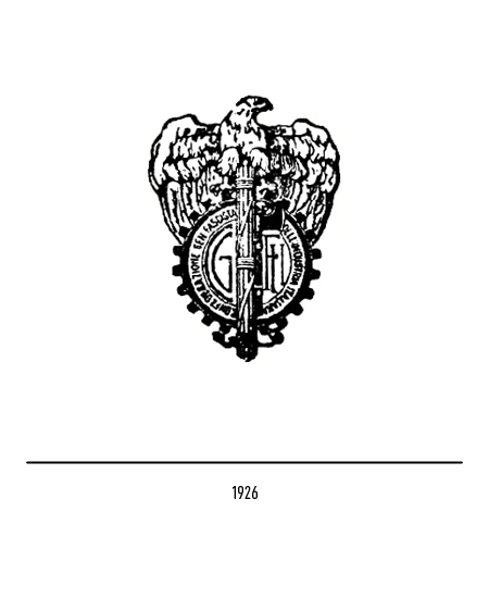
In 1926, with the rise of fascism, the Confederation resigned itself to recognizing the fascist trade union as the only interlocutor; the fascist fasces is added to the logo and the name becomes “Fascist General Confederation of Italian Industry”.
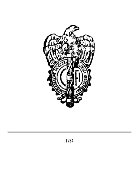
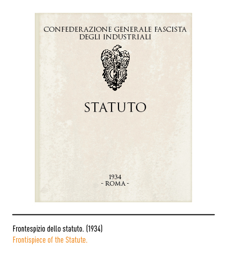
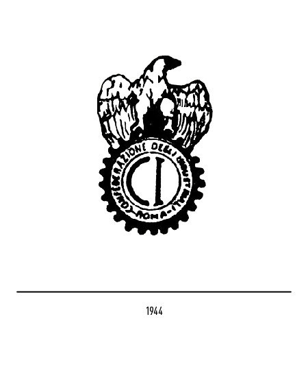
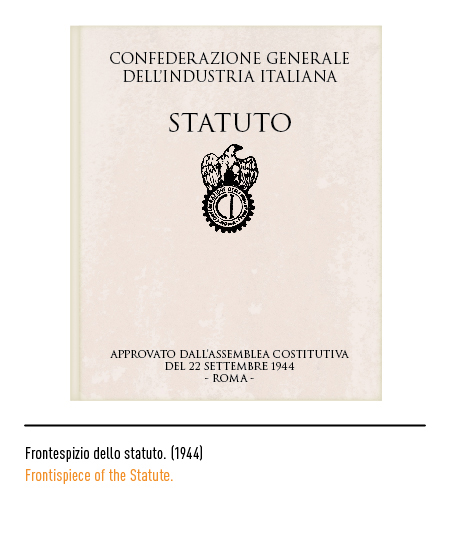
Later, in 1934, the word “general” disappeared to give greater prominence to the national federations of the sector. We had to wait, in 1944, for the fall of fascism to see the fasces disappear from the logo. The name was also further changed to “Confederation of Industrialists”.
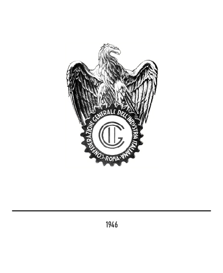
In 1946 the eagle is accentuated in size and defined in its features; above the toothed wheel bearing the inscription “General Confederation of Italian Industry”. Confindustria assumed a leading role in the post-war reconstruction work, signing important agreements with the trade unions and strengthening its organizational structures.
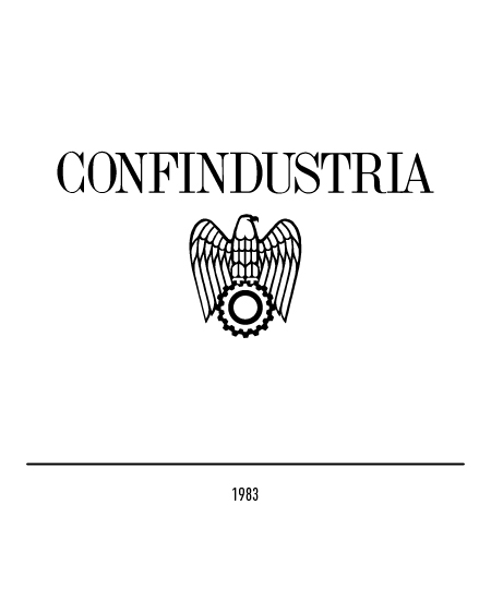
In response to the demand for a more modern and stylized emblem, the new branding was approved in 1983. In this way, a change was now definitively established in external and internal communication, faster and more memorable, enhancing its communicative power.
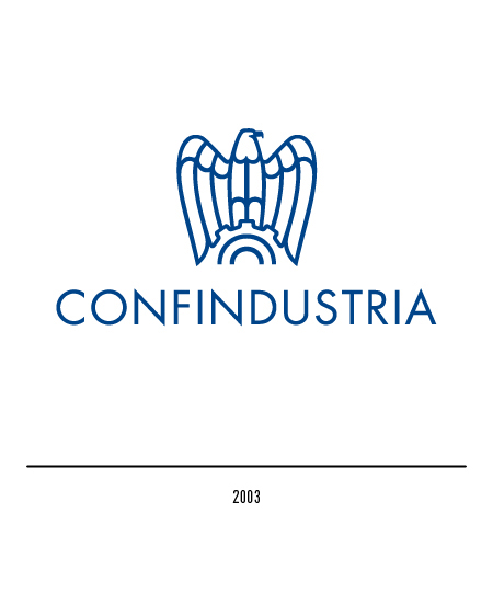
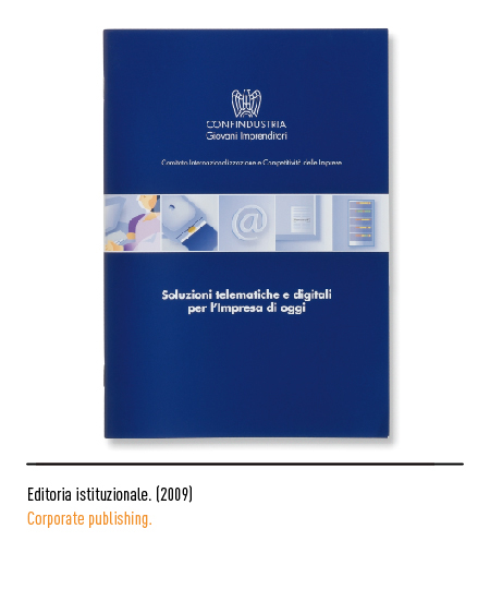
In 2003 the restyling of the logo was entrusted to the Inarea agency; confirming the undisputed value of the historical emblem, the stylization of the eagle is accentuated making it lighter and the claw marks, already resized in the 1983 version, have been eliminated. The gear remains to signify the strong connection with the real economy but the toothed wheel attenuates the technical features and opens up to symbolize an ever greater integration with the emerging sectors of the production world. As a whole, the new emblem also has the fundamental advantage of improving its readability on computer media, now prevalent in modern communication. The font of the logotype used is the Futura.


