FERRAGAMO
1 Logos and restyling over time
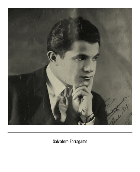
Fashion house founded in Florence in 1927 by Salvatore Ferragamo, of Bonito in the province of Avellino. In 1914 he had moved to Boston, in the United States, bringing with him his great passion for shoes and great craftsmanship; in the early 1920s he moved to Santa Barbara, California, where he opened a shoe repair shop. California was, in those years, the fabulous land where the film industry began to thrive; Actors and actresses soon began to order made-to-measure shoes so that Salvatore Ferragamo quickly gained the fame of “shoemaker of the stars”.
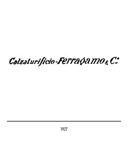
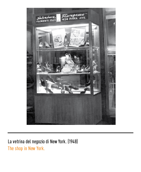
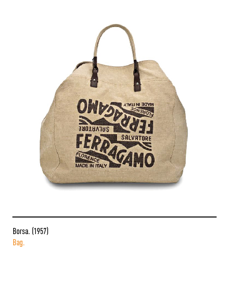
Faced with the high production costs and the lack of skilled craftsmen, in 1927 he returned to Italy, establishing the “Calzaturificio Ferragamo”; in a pioneering advertising photo the characteristic logo of a typographical matrix appeared.
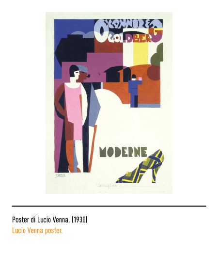
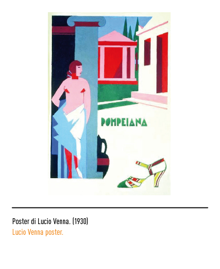
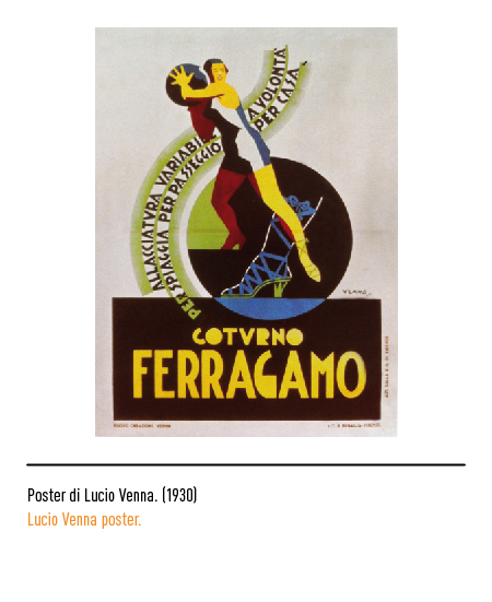
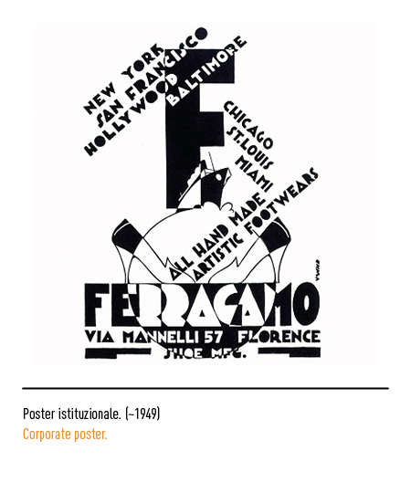
In 1930 he relied on the futurist artist Lucio Venna for the first advertising campaign.
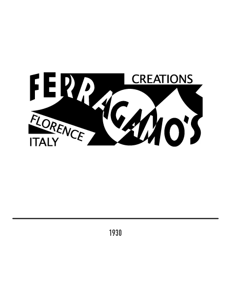
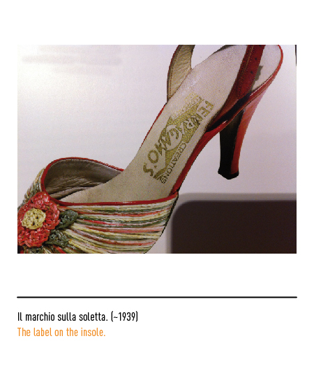
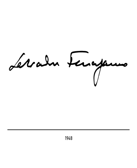
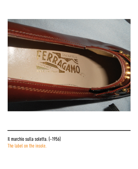
In 1930 the logo-label “Ferragamo’s creations Florence Italy”, linked to the production of women’s shoes intended exclusively for the American market, with the artist’s surname linked to that of the city of Florence; as if explicitly saying that an artfully crafted shoe was produced in a city of art. In 1938, with production growing strongly, Salvatore Ferragamo bought the Palazzo Spini Feroni in Florence for the headquarters of his company. Since 1940 the logo has been linked to his autograph signature.
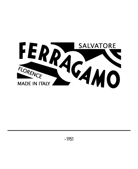
At the beginning of the 1950s, on the occasion of its first show in Florence, the logo-label underwent a slight restyling: the black-white contrast is attenuated and the designer’s name also appears.
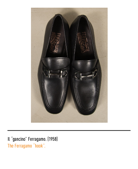
In 1958 the “hook” motif on a bag made its first appearance: even if it did not represent the official logo, it is the image that immediately appears in the minds of many because it is applied to many accessories and clothing; an oral tradition tells that the source of inspiration was the wrought iron gate of Palazzo Spini Feroni.
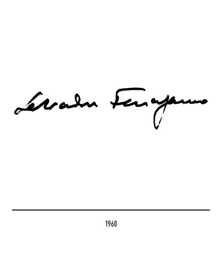
In 1960, after the death of the founder, the logo of his personal signature was adopted. The company remains in the hands of his wife and their six children who, upon reaching the age of majority, have played a key role in the company, contributing to its expansion.
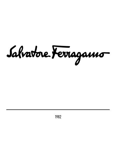
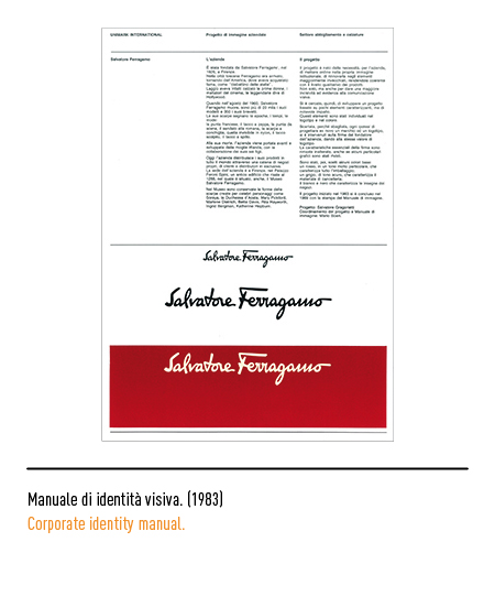
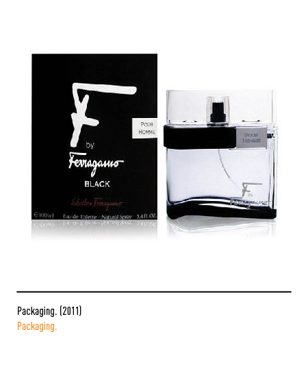
In 1982 a further restyling, carried out by Salvatore Gregorietti of Unimark International, with the stylization of the founder’s signature; to give greater incisiveness and evidence in visual communication, we have intervened by giving the same logo value. The characteristics of the signature have remained unchanged even if some graphic details have been revised. The initial letter “F” suggested the printed designs of some fabrics and the name of a perfume.
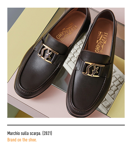
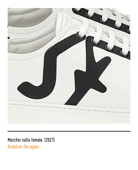
In 2021 a collection was presented with the highly recognizable “SF” monogram derived from the signature of the founder.
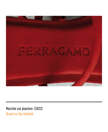
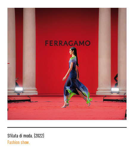
In 2022, a rebranding operation, conducted by the English designer Peter Saville, led to the reduction of the name and surname to just “Ferragamo” also because the public of the logo usually does not pronounce the name. It confirms the trend of fashion logos in reducing and simplifying the elements of communication to create a more neutral and less decorative identity, especially in typography. The logo is composed with a font with light graces, inspired by the stone inscriptions of the Florentine Renaissance. Another novelty of the rebranding is the new red color that accompanies the new visual identity.


