MARTINI
1 Logos and restyling over time
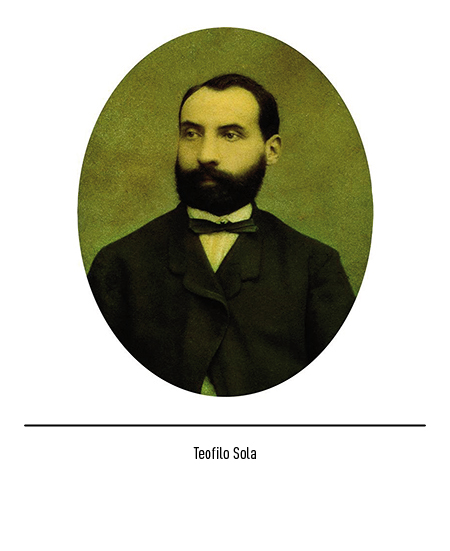
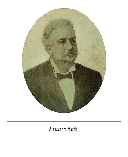
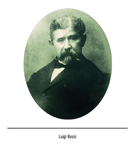
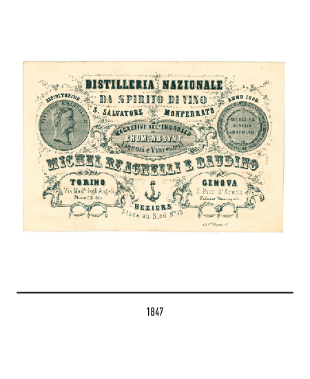
The company’s history dates back to 1847 when four enterprising Piedmontese merchants (Clemente Michel, Carlo Re, Carlo Agnelli and Eligio Baudino) founded a distillery in Turin called “National Distillery for the spirit of wine” based in San Salvatore Monferrato (Alessandria). In 1850, while the company expanded with a warehouse in Genoa, Alessandro Martini and Teofilo Sola joined the company, respectively as salesman and accountant. The Turin industrial area of the time was characterized by a great entrepreneurial fervor and also the wine production, in particular that of liqueurs and vermouth, found a way to grow in size. In 1863 Alessandro Martini and Teofilo Sola decided to take over the business by officially setting up “Martini, Sola e C.ia” in Turin, in which the liqueurist Luigi Rossi who owned an aromatic herb shop participates as a third partner.
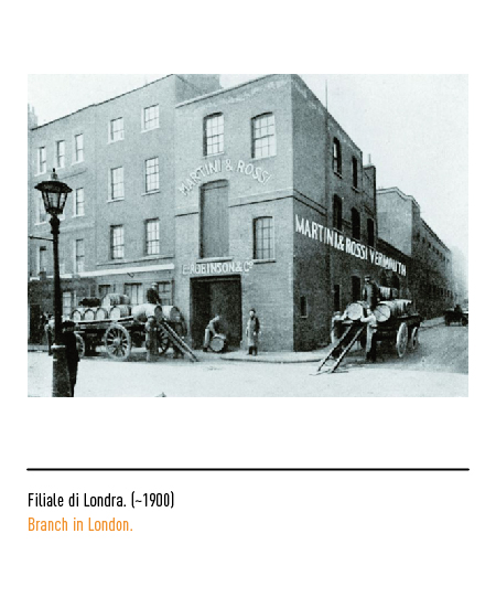
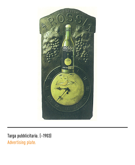
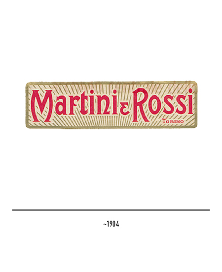
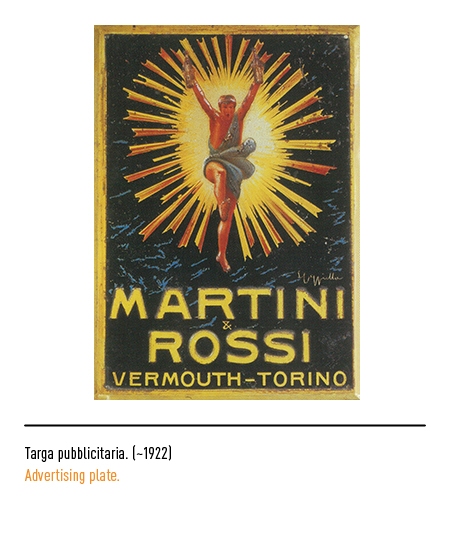
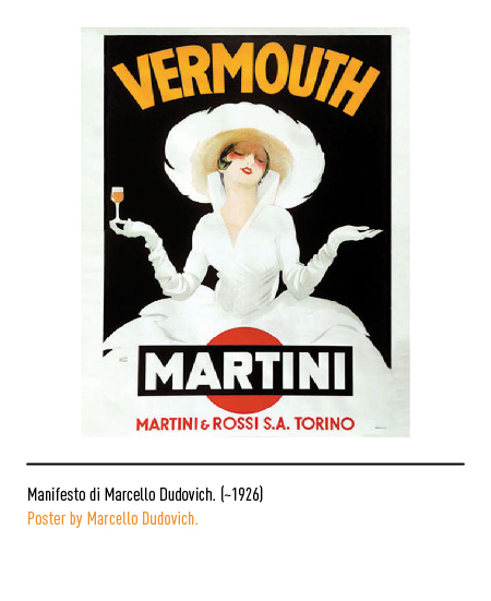
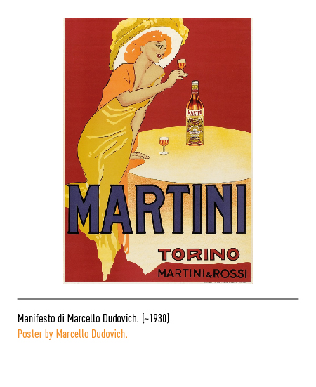
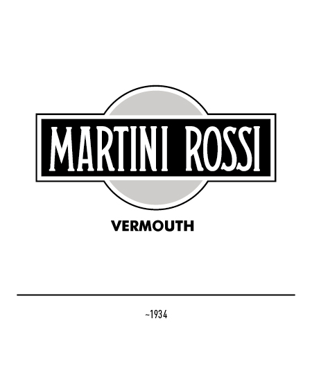
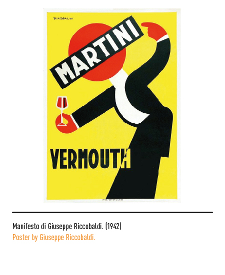
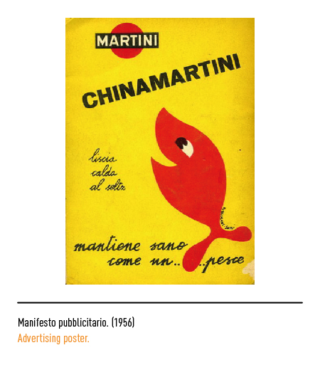
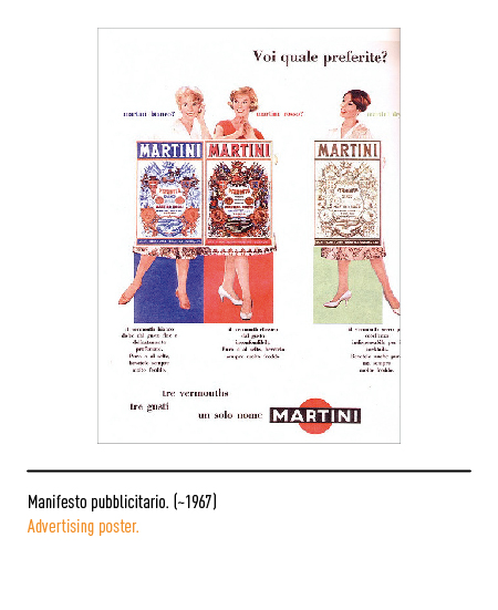
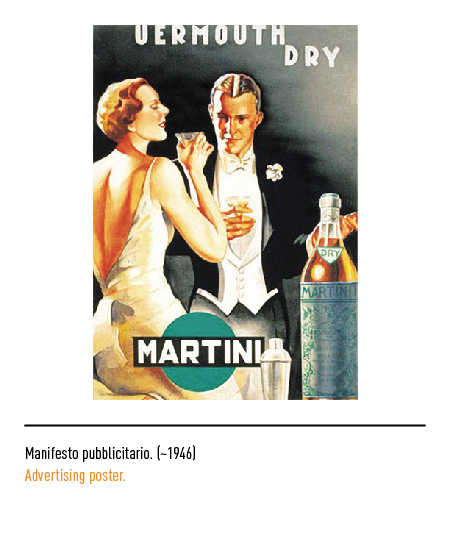
In 1864 the first Martini bottle was created, designed by the founders themselves, and the Pessione di Chieri (Turin) plant was inaugurated. In 1879 Teofilo Sola died and the company, therefore, took the definitive name of “Martini & Rossi”. From that moment on, the company focused on large-scale exports, also thanks to the opening of some branches abroad, and ensured excellence in the quality standard of products, especially vermouth. It was at the beginning of the twentieth century that the name “Martini” imposed itself on the other denominations, becoming the name that indicated the vermouth of “Martini & Rossi”. The management has always held in high regard communication and, in particular, the poster as the main advertising vehicle, so much so as to make the logo an icon of “made in Italy”; therefore the company constantly resorted to the work of the most important poster designers including Marcello Dudovich in the 1920s with the fascinating “White Lady”.
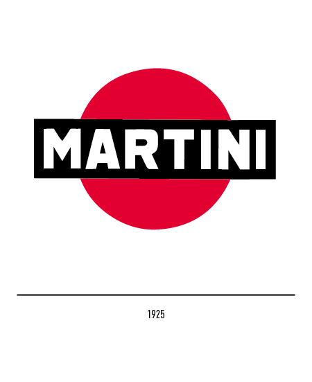
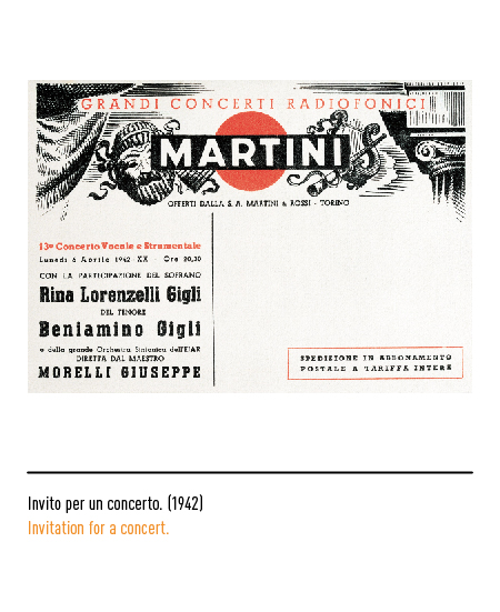
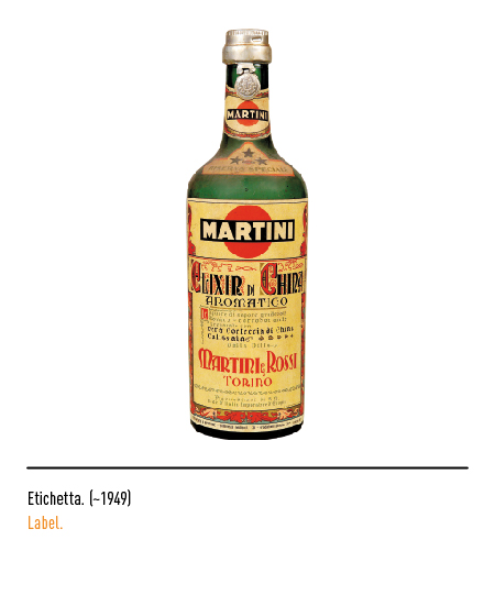
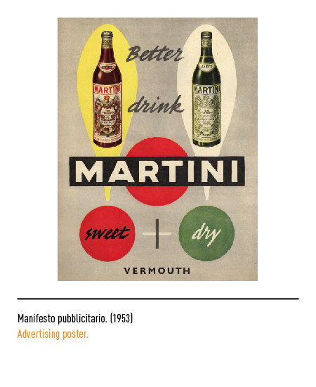
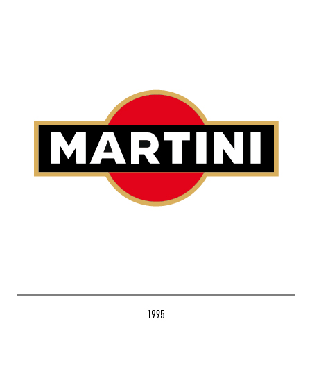
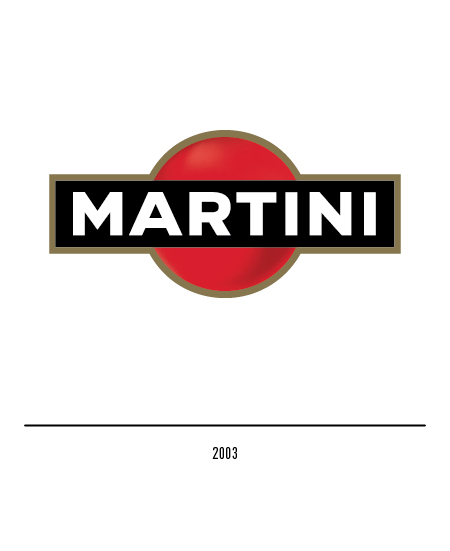
In 1925 the famous logo was born, defined as “ball and bar” by the Anglo-Saxon world, that is the icon formed by a red circle surmounted by a black rectangle with the word Martini, composed in capital letters. The origin is not exactly documented but, traditionally, it is said that it was the designer Livio Cibrario, returning from London, who submitted three logo models to the owners; among these they chose on impulse, with very happy intuition, the one that was then used.
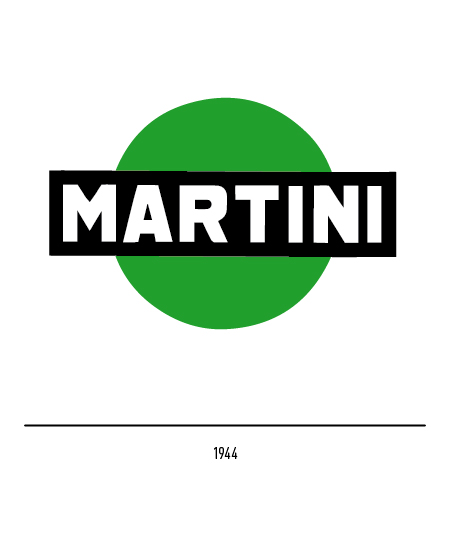
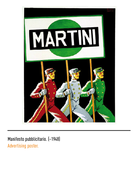
Curious detail: this logo appeared in 1944, for a short time, also with a green circle.
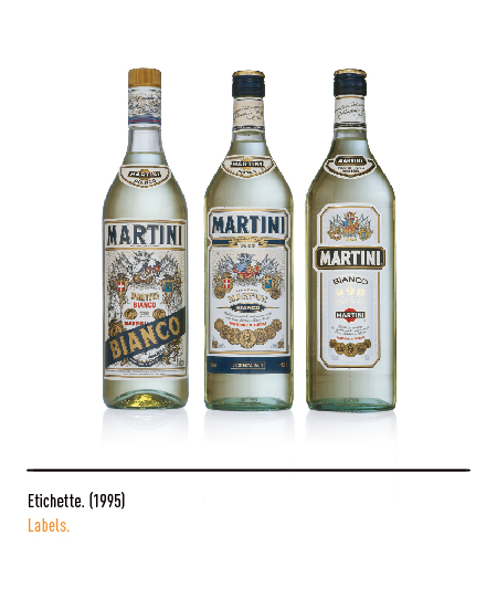
For over fifty years the logo has not undergone substantial changes; in 1995 the Di Robilant agency oversaw the restyling of the logo with the setting of the character, shapes and colors.
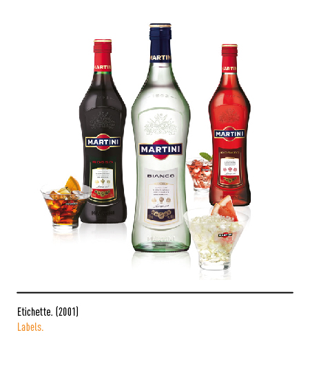
In 2003 the same agency made the red circle three-dimensional, giving new value to all the elements of its image.


